Choosing the right Classification Method for your Choropleth Map
When building a choropleth map, one of the most crucial choices you will make is how to classify your data, i.e. group your data into color-coded categories on the map.
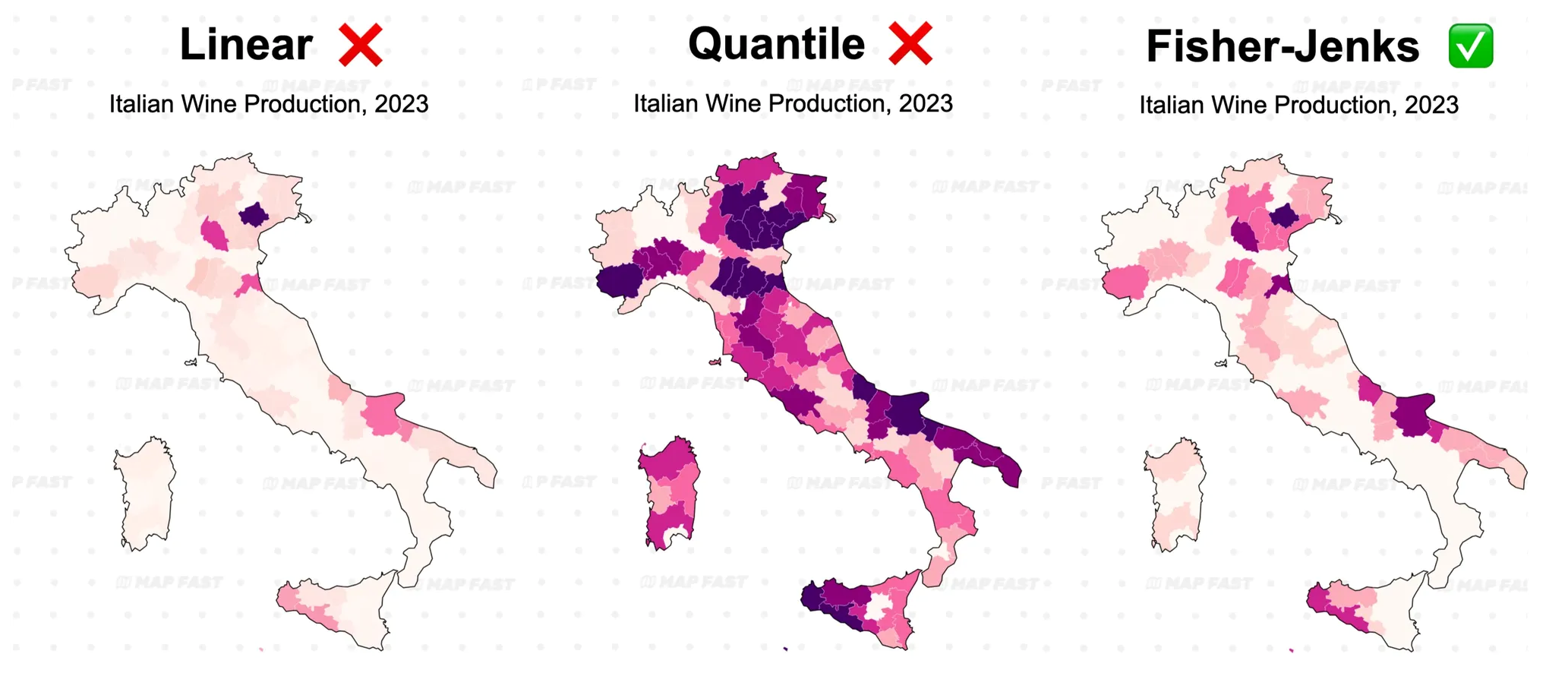
But how to pick the best option? In this article, we’ll explore three common classification methods: continuous linear, quantile, and Fisher-Jenks, and discuss how to decide the number of intervals for your map. We’ll look at examples with two maps for each method.
By the end, you’ll be able to make more informed choices about classifying your data and create maps that tell the most accurate story possible. Let’s dive in!
This article is part of our guide on choropleth maps. Be sure to check it out:
1. Linear Classification: smooth transitions across values
Linear classification (or “continuous linear gradient”), maps your data along a smooth color scale, where each unique value corresponds to a shade of color between minimum and maximum values.
This approach avoids setting predefined intervals, instead allowing for a seamless transition in color, which can be effective for continuous data without clear clusters.
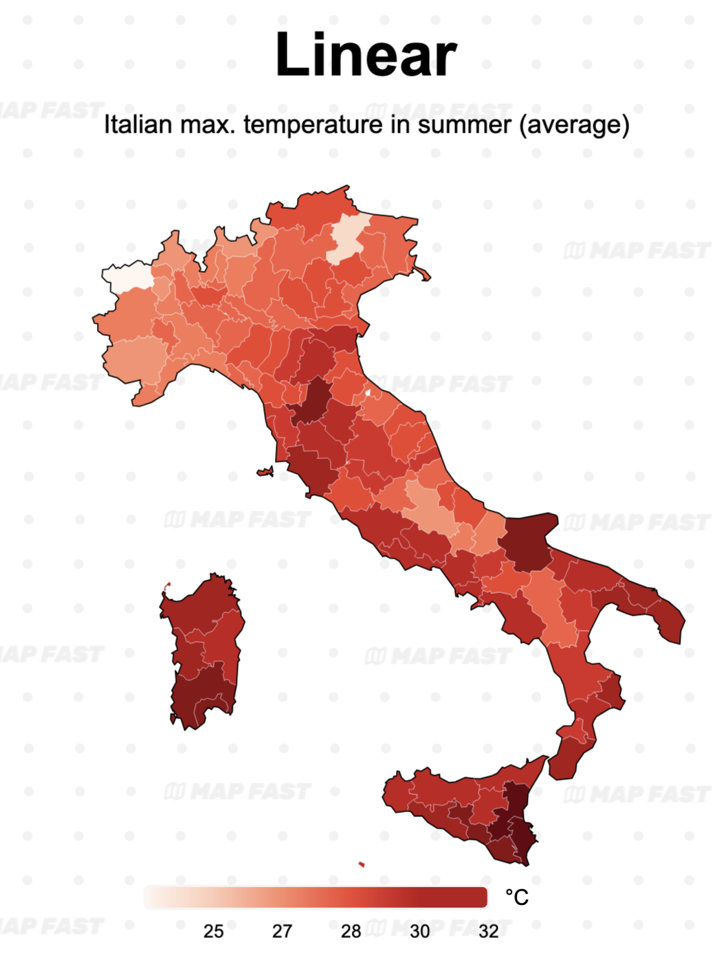
Map 1: The temperature data is a good fit for the linear map: we can see a smooth gradient of red shading gradually darker. On the other side, we have two outliers (low values) that are highlighted more than they should be on the map.
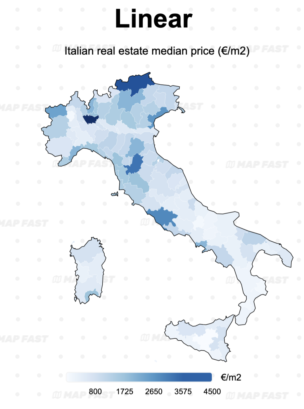
Map 2: the linear gradient is not optimal for the real estate housing price map, as it overemphasizes extreme values (like Milan). As we will see below, a quantile or Fisher-Jenks classification might be better.
↘️ When to Use Linear Classification:
- Best for data without distinct groupings, providing a visually smooth representation.
- Works well when you want to show subtle variations across regions, like temperature or elevation.
However, linear classification can be misleading when there are extreme values, as these outliers might dominate the color scale and obscure smaller differences. For example, in the real estate prices map, extremely high median values cause all other values to appear lighter, making the map harder to interpret for regions with lower price but still significant differences.
2. Quantile Classification: equal number of data points
Quantile classification is all about balance, with each interval containing an equal number of data points. Say you have 100 data values and five intervals—each interval will include 20 values. This approach is useful for highlighting relative differences between regions, especially when you want each color on your map to cover a similar number of areas.
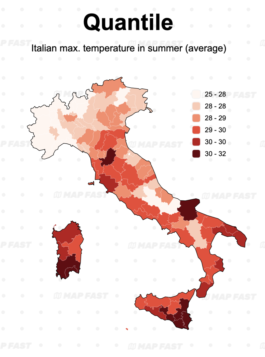
Map 1: The temperature map is now more “clustered”. This is the result of the classification: instead of having a linear gradient (as many classes as there are values), we now have 6 groups. Compared to the linear gradient, differences between minimum and maximum areas are clearer.
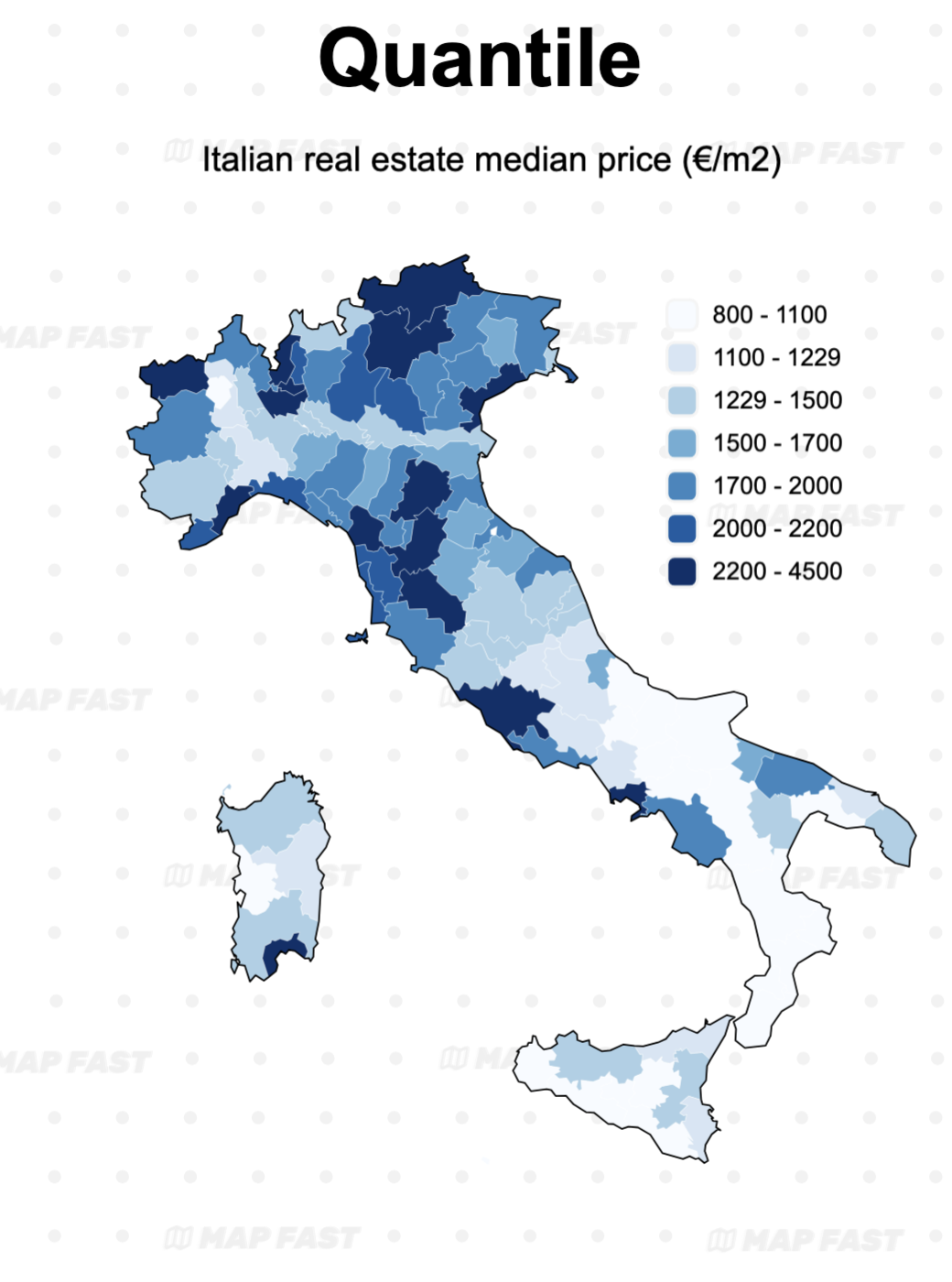
Map 2: Quantiles classification now shows the regional patterns of the real estate map. patterns in the data—which is much more interesting! The drawback is that really high values are now mixed in a group with lower values. Increasing the number of groups (>6) might mitigate this problem, to a certain point.
Notice that intervals can be tricky to explain, as they may start small and widen later.
↘️ When to Use Quantile Classification:
- Ideal for data with a broad distribution, like income or property prices, where you want to emphasize relative differences between regions.
- Useful for audience-friendly maps since each interval has a similar number of areas, providing a balanced visual effect.
One drawback is that quantile classification can exaggerate small differences when values are closely packed together. For instance, in a map of median income, minor variations in middle-income areas could seem more significant than they are.
3. Fisher-Jenks Classification: natural patterns
Fisher-Jenks classification groups data into intervals that minimize the variation within each class, effectively highlighting “natural breaks” in your data. It’s a more complex approach but can create a highly intuitive map that emphasizes patterns and clusters.
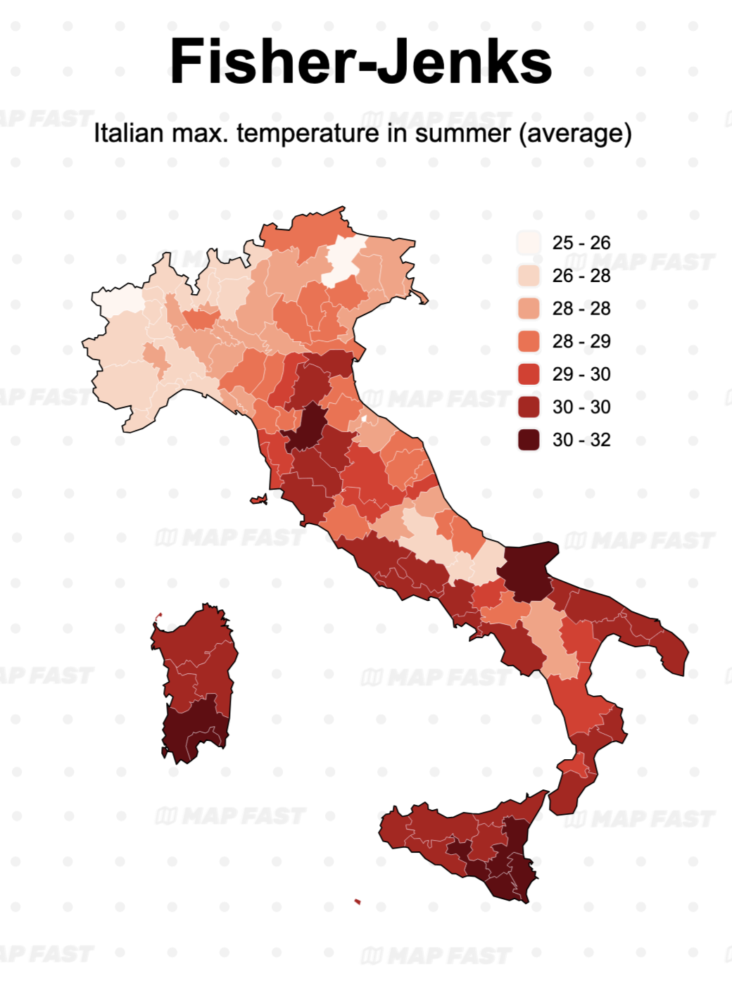
Map 1: The Fisher-Jenks is here a successful mix between the Linear and the quantiles classification : regional differences are clearer than with Linear while the color gradient is smoother than in Quantile.
(Author’s note: while the fact we have 7 groups instead of 6 helps, this readability is still a feature of this method.)
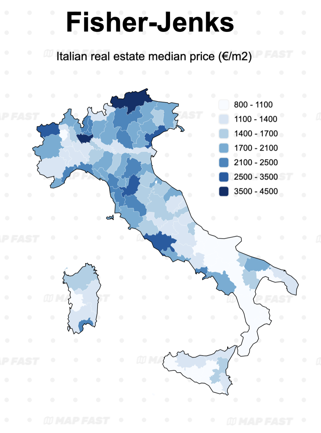
Map 2: This map is also clearer than the quantile version, as high values stand out clearly while still showing a smooth gradient.
Just like the Quantile, it produced steps that might be harder to explain. But in this case, IMO, they are more intelligible. This is not always the case with Fisher-Jenks.
↘️ When to Use Fisher-Jenks Classification:
- Ideal for data with clear clusters or natural breaks, such as temperature zones, pollution levels, or population density with distinct regional differences.
- Great for analysis-focused maps that need to reveal subtle but important patterns.
While Fisher-Jenks can give a more nuanced picture, it’s also harder to explain to a non-expert audience. Additionally, it may create intervals that don’t follow a predictable pattern, making legends slightly less intuitive to interpret.
Choosing the right number of intervals
Deciding on the number of intervals (or “steps”) is as essential as choosing the classification method. Too many intervals can make the map visually overwhelming, while too few might obscure important details. Generally, 5-7 intervals is a good balance, keeping your map informative without being cluttered.
Quantile example
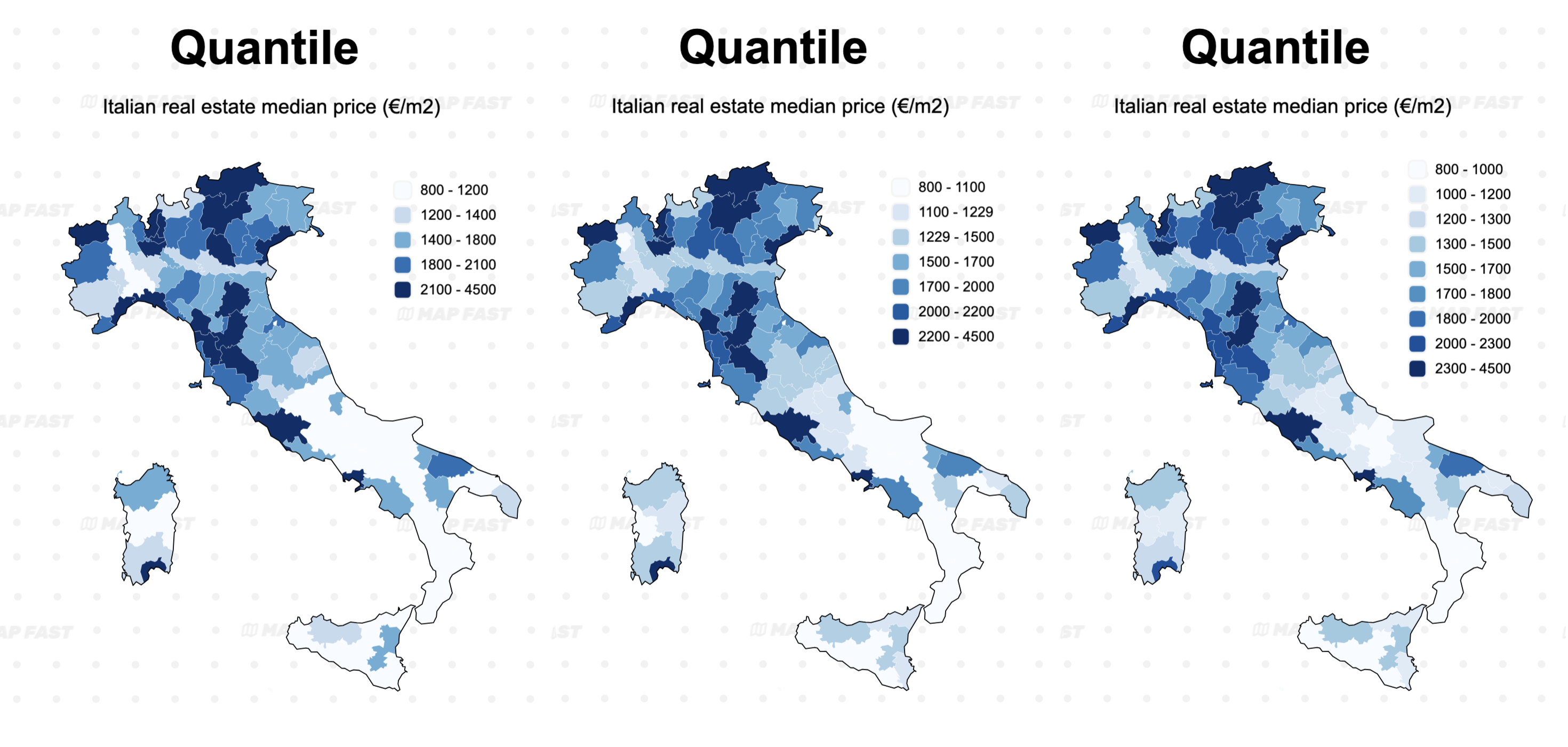
As you can see, the quantile classification does already a good job at highlighting the main global differences, even with only 5 classes. Increasing the number of classes to 9 doesn’t change the result much but makes the legend more complex.
However, the classification produced naturally nice steps, easy to understand (i.e. rounded steps, with often a range of 200€/m2).
Fisher-Jenks example
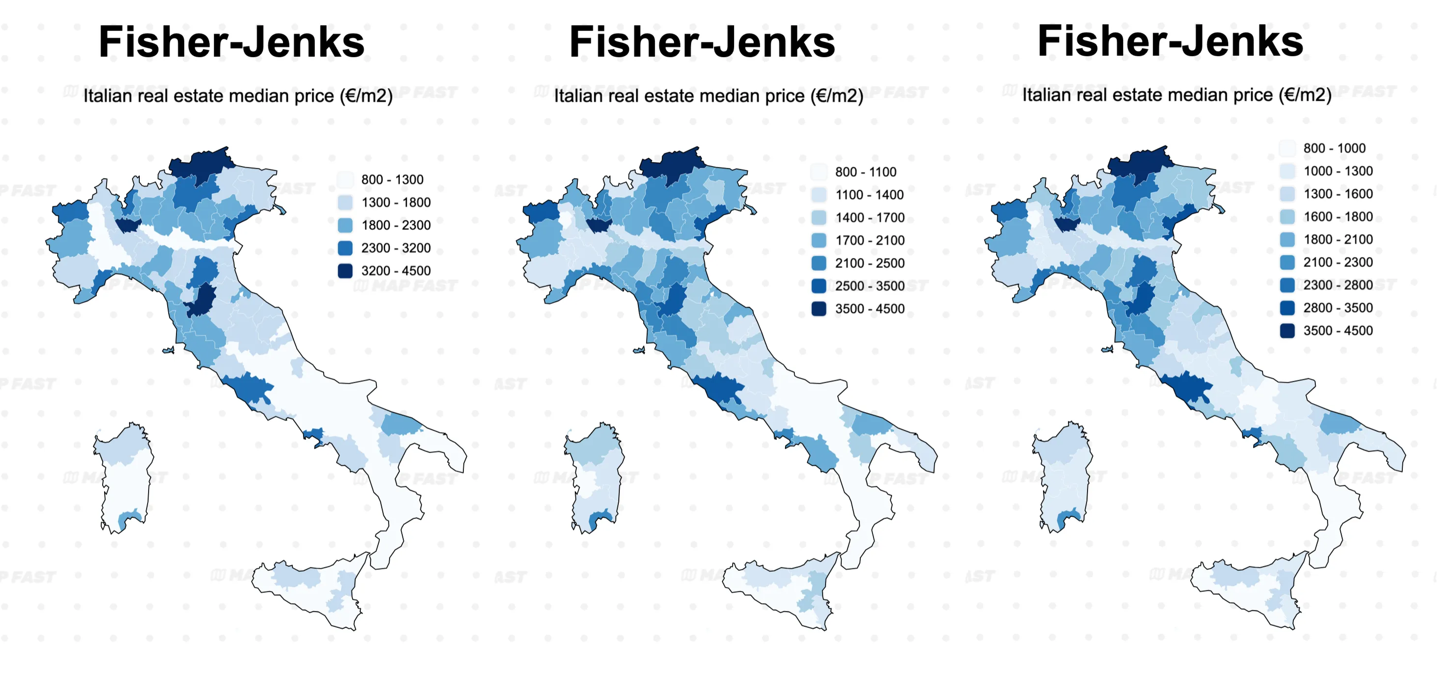
Increasing the number of steps from 5 to 7 also helped the Fisher-Jenks classification to better highlight variations in price. However, we might not need to increase it up to 9, because the map looks almost the same for the added complexity of two more steps.
You can also notice the difference here with quantile 9: the ranges fluctuate between 200-300€/m², then quickly widen. This can be confusing for some readers 🥸
In conclusion
- For beginner-friendly maps: 5-7 work well, especially for straightforward data where less detail is acceptable.
- For detailed analysis maps: 7-9 intervals can provide more granularity, but be careful not to overdo it—more intervals don’t always mean better insights.
Wrapping It Up
Choosing the right classification method and number of intervals for your choropleth map can make all the difference in how clearly and accurately your data is communicated. Whether you’re working with a continuous linear gradient, quantile, or Fisher-Jenks classification, think about what you want your map to show and who your audience is.
With these tools, you’ll be on your way to creating visually impactful, insightful maps that convey the true story behind your data.
Learn more:
- Why maps require normalization (coming soon)
Happy mapping! 😊