How to create a Europe map with MapFast?
The goal is to create a map that shows the net contribution to the EU budget. It will highlight member states that are either contributors or beneficiaries:

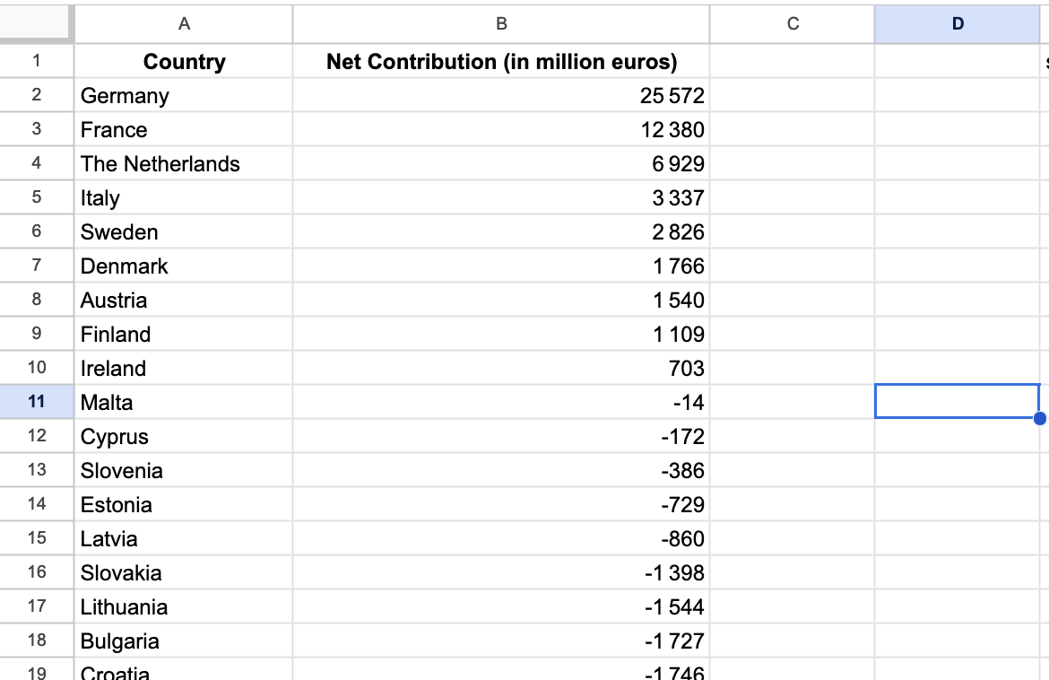
Import the data
We will use data from an article on the Statista website: “Which Countries are EU Contributors and Beneficiaries?”. The data is from 2021, but still relevant to plot.
Since the data was presented as a graph, I manually extracted the 27 values into a table. You can download the exact data from this Google Sheet (File > Download as Excel).
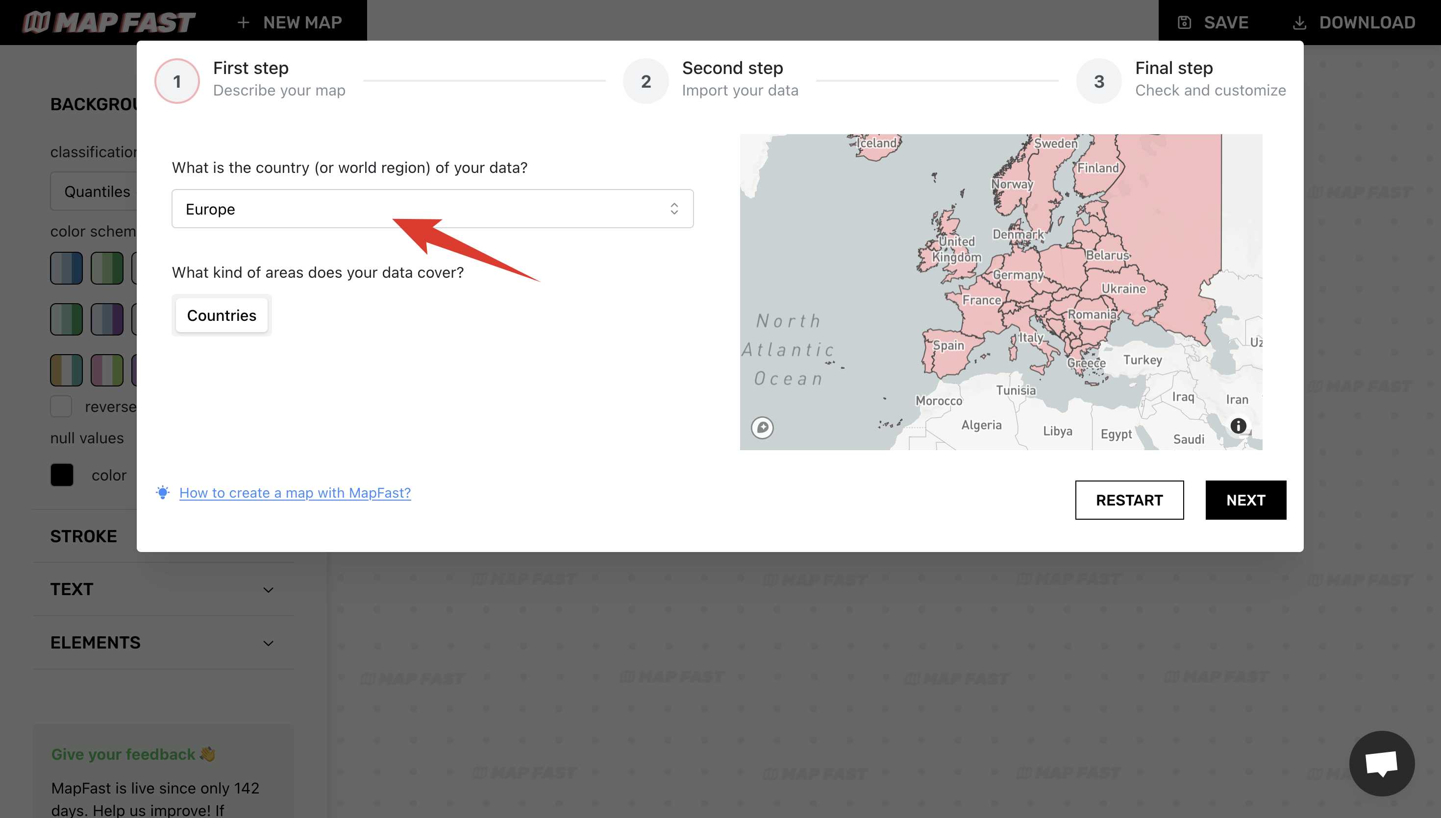
Now, let’s open the MapFast app and select “Europe” for the map area:
Once the preview map has loaded, we can upload our data by clicking the “Import Excel/CSV file” button. Once the upload is complete, you should be able to see the data in the table view on the right:
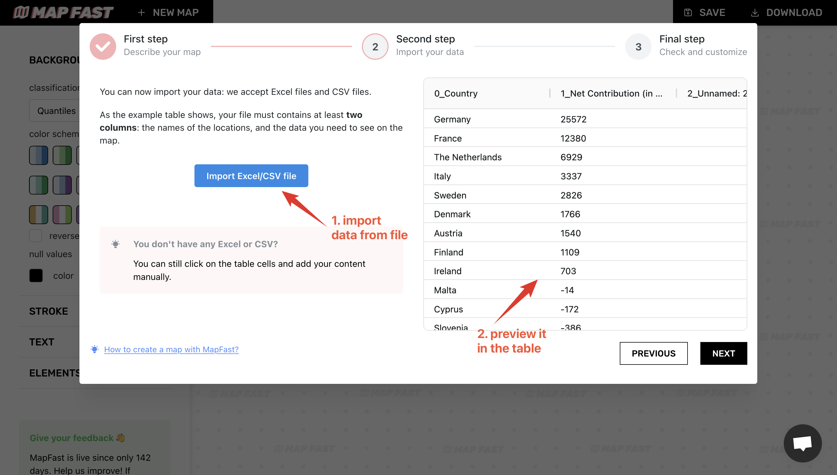
This view enables you to check that you have one row per location. This is a very important requirement. It doesn’t matter what the column names are in the imported file, but there must be a clear column containing the location, and only the location.
Review associations between rows and countries
At this point, MapFast will try to associate each row of the CSV file with a country from its database. Once finished, we need to review the matches, to be sure that everything will be displayed correctly.
After clicking “Next”, you’ll see a table with 2 columns: the first column contains locations from the CSV file we imported. The second one contains the country that was matched with the row. That’s what we need to check.
Most of the lines appear green, but some may show up red because no match has been found. In our case, we only see European states that are not members of the EU: Cyprus, Switzerland, etc.
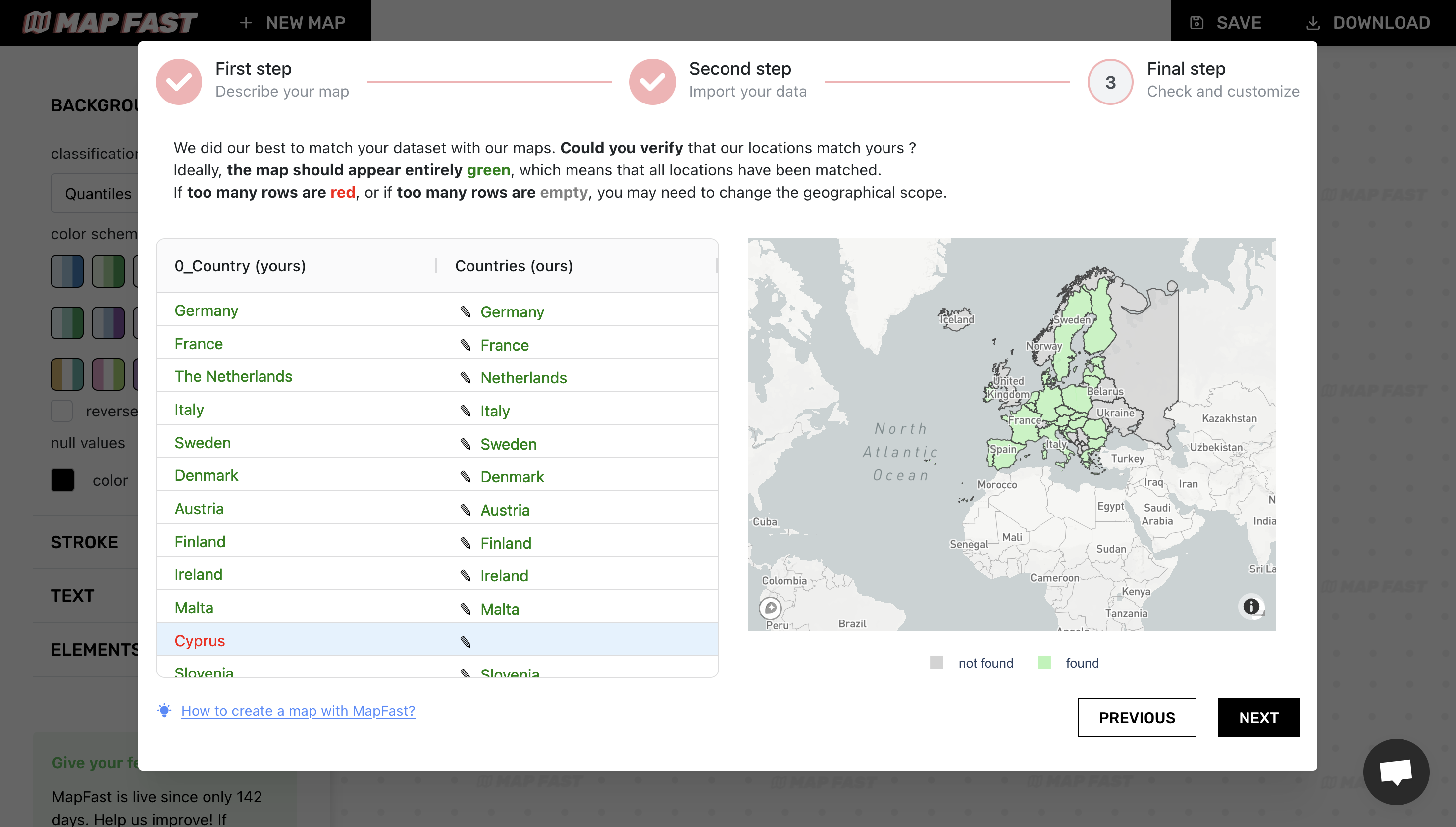
The map on the right shows the completeness of our data. In this case, we have nothing to do, all 26 EU state members have been matched correctly ✅
Map preview
The last step is really straightforward: we just need to pick the data column. In our case, it’s ‘Net Contribution (In Million)’.
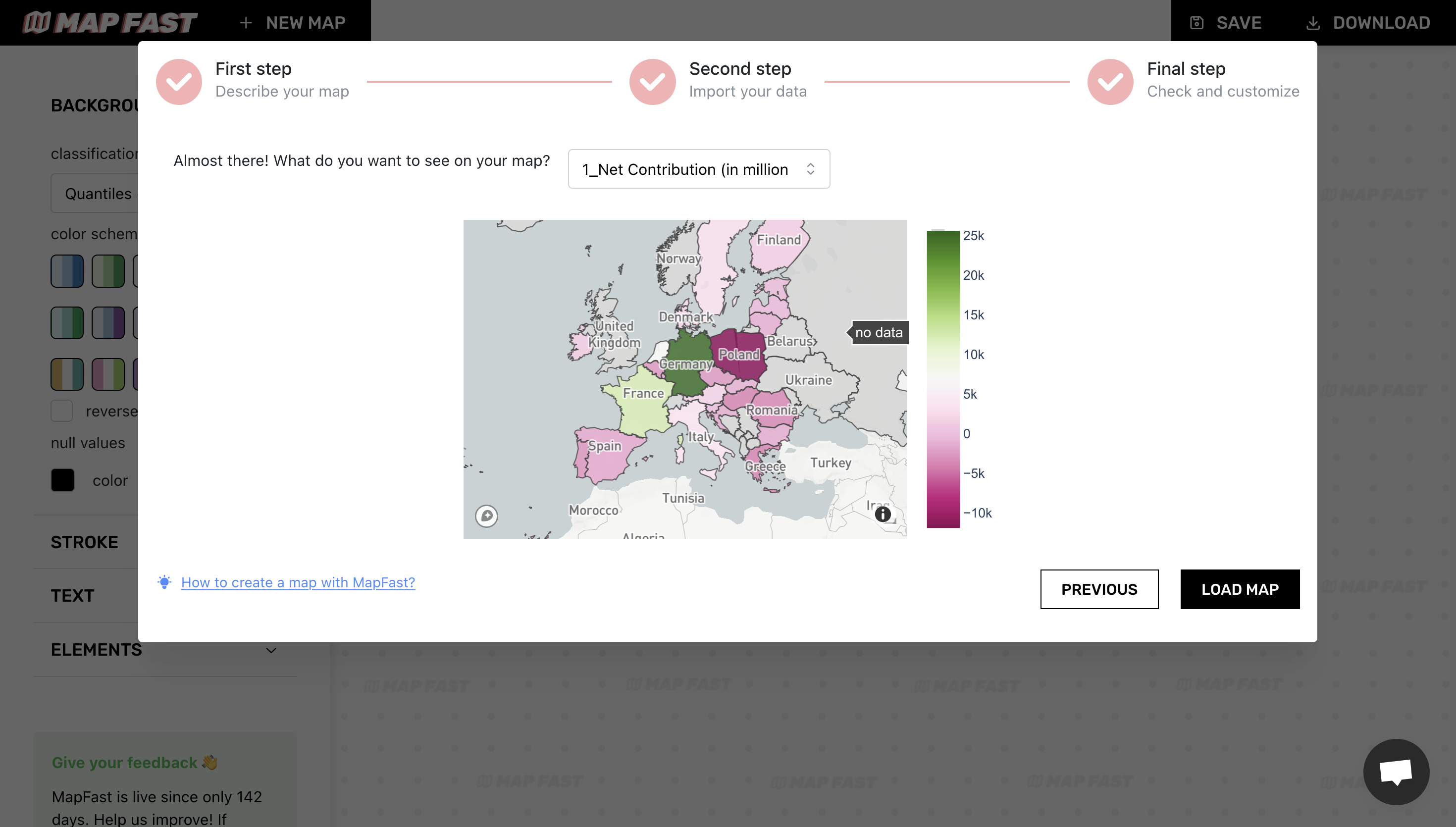
The map will show a preview of the data. This is useful to check that everything is fine (I actually had to redo the work for this tutorial, because I noticed an error in my data at this screen!).
We will customize its appearance afterward. Click “Load map” when you are ready!
Customization
Once our map is loaded, we can start the fun part: customizing the map ! 🙂
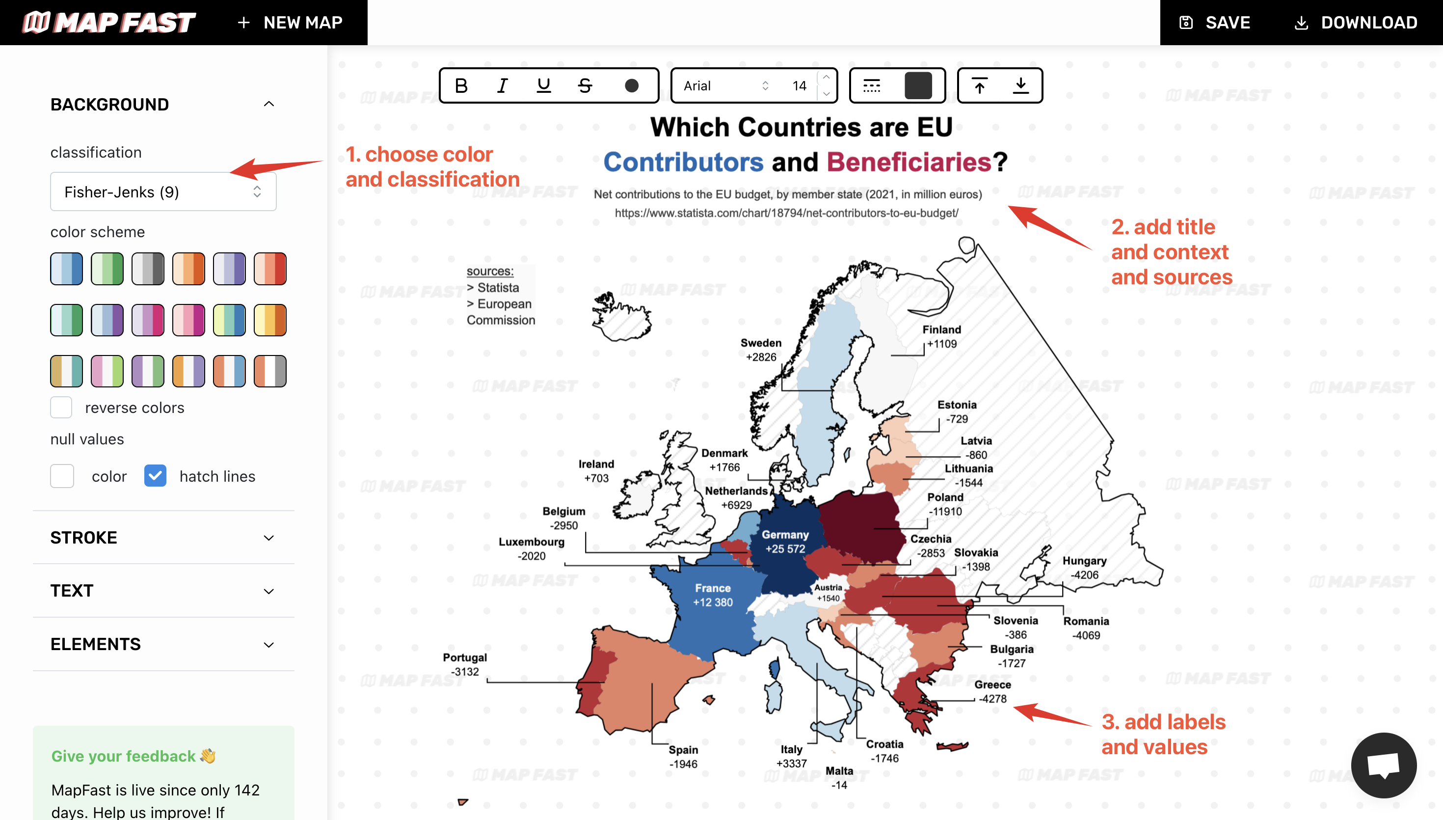
Let’s customize it :
-
Set the appropriate color and scheme.
- As I want to have a clear distinction between positive and negative values, I picked a Fisher-Jenks & Red-Blue divergent color scheme (in-app : ‘Background > Classification > Fisher Jenks 9’).
- I also set a transparent color for missing values, with hatch. And modified the stroke color to black see the hatch. (in-app: ‘Stroke > Inside stroke’)
-
Add map title and source. It is very important to add context to a map, that gives credibility.
- I’ll go for the same title and subtitle as in the original Statista article (in-app: ‘Text > Title’)
- And credit Statista and the European Commission for the data source (in-app: ‘Text > Source’).
-
Add legend or values. The legend is essential if values are not properly displayed on the map. But in this case, I found interesting to display the country name and its value. (in-app: ‘Text > Label column = name’ & ‘Text > labels callout = Manhattan’).
- Select the country name as label
- Remove all unnecessary countries that are not in the E.U.
- Modify all labels to include the value
- Select manhattan callouts
- Place them on the map aesthetically
Final result
That’s it! You now have a beautiful Europe map. 🙂
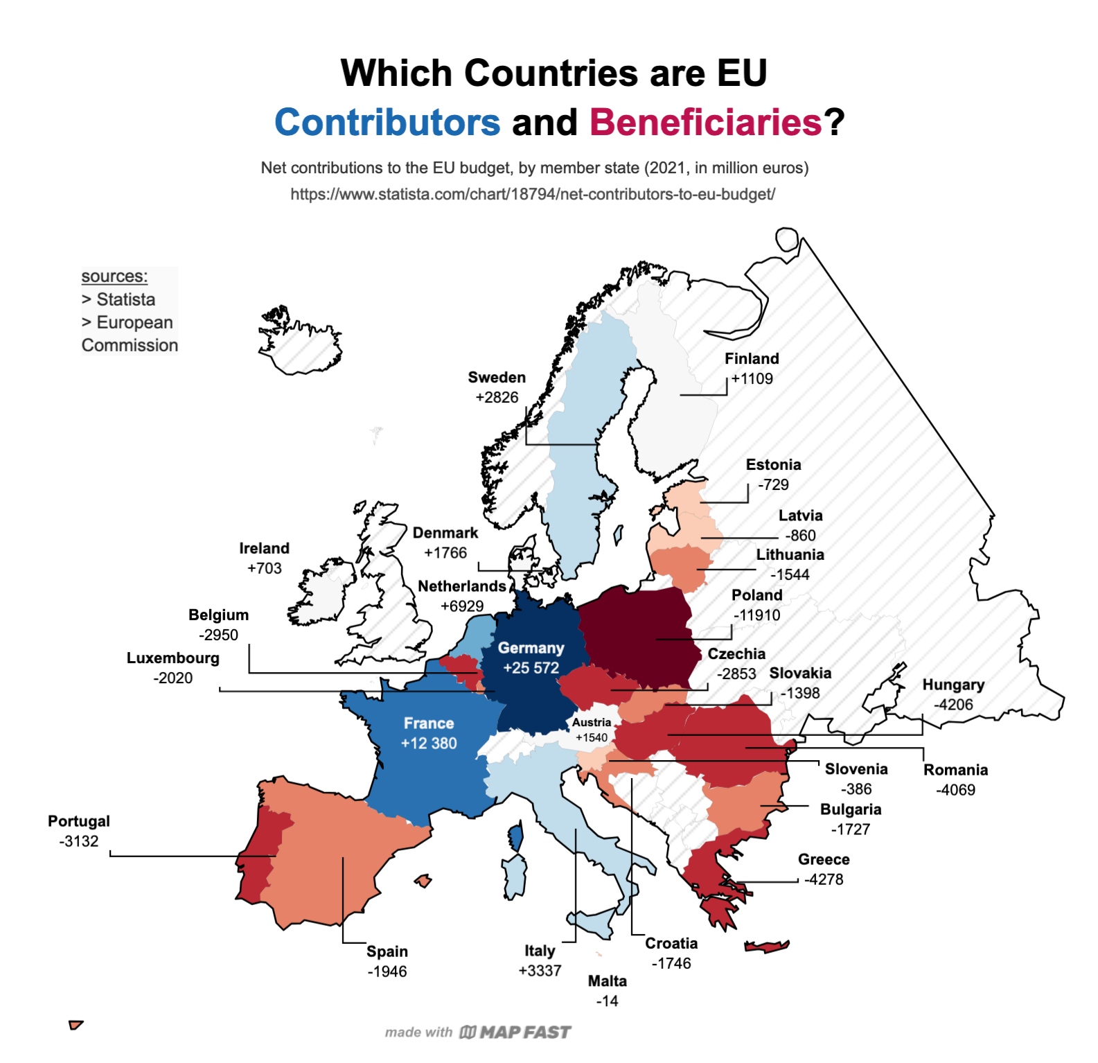
You can export it using the “Download” button as a PNG or SVG with the resolution that you need.
Happy mapping ✨