How to create a World map with MapFast?
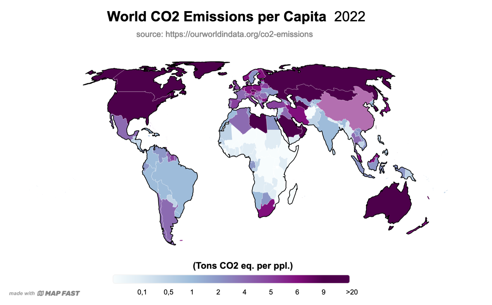
The goal is to create a map that shows the actual per capita CO2 emissions. It will highlight countries in the world that have the largest impact on global emissions:
Import the data
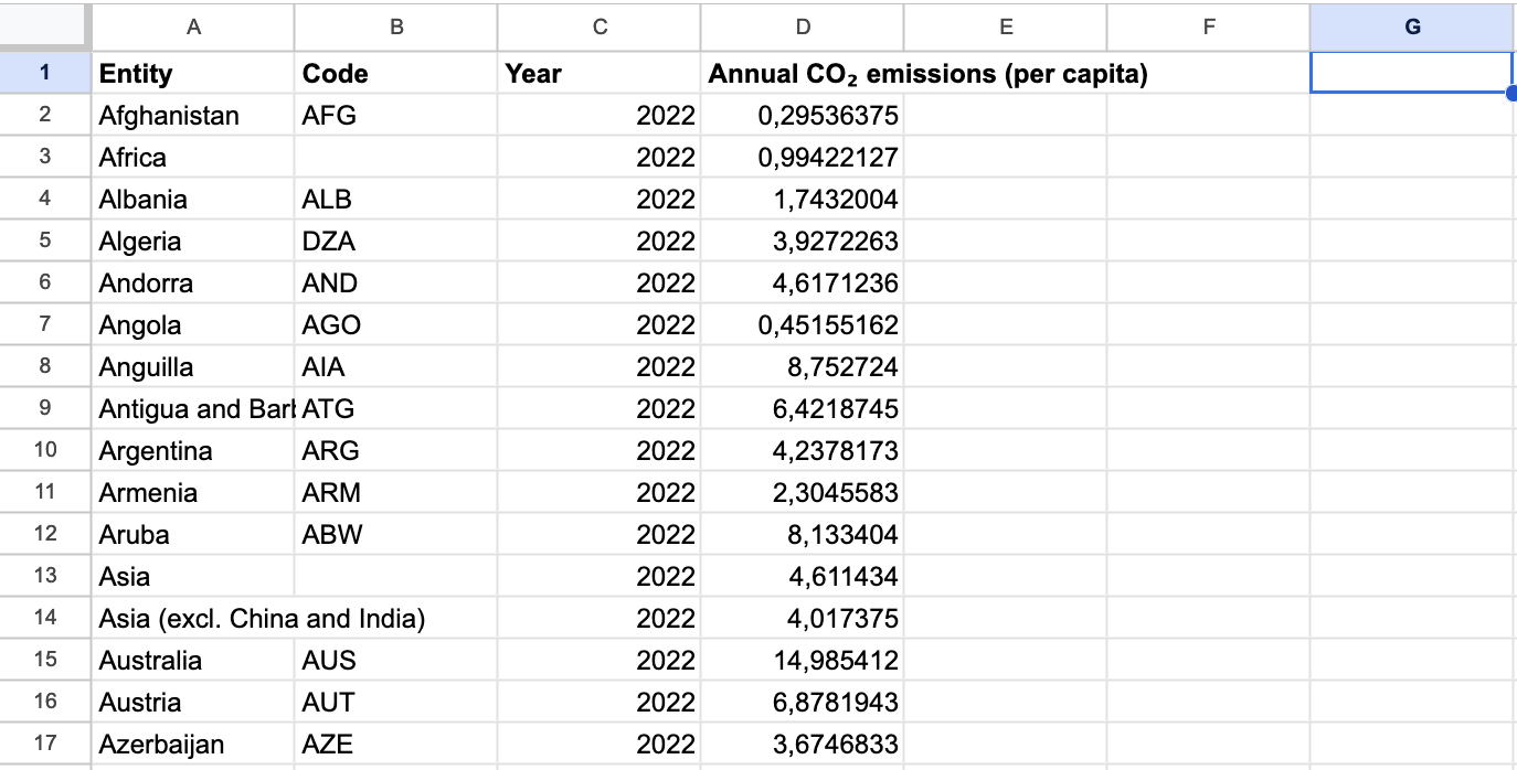
We will use data from the amazing website “Our World in Data”: https://ourworldindata.org/co2-emissions. I will download the “per capita emissions” data as CSV and modify it.
The file contains one row per year and per country. But as we want to depict countries, we need to ensure that the file contains only one row per country.
So we can filter out every year except the most recent one, 2022. You can download the exact data from this Google Sheet.
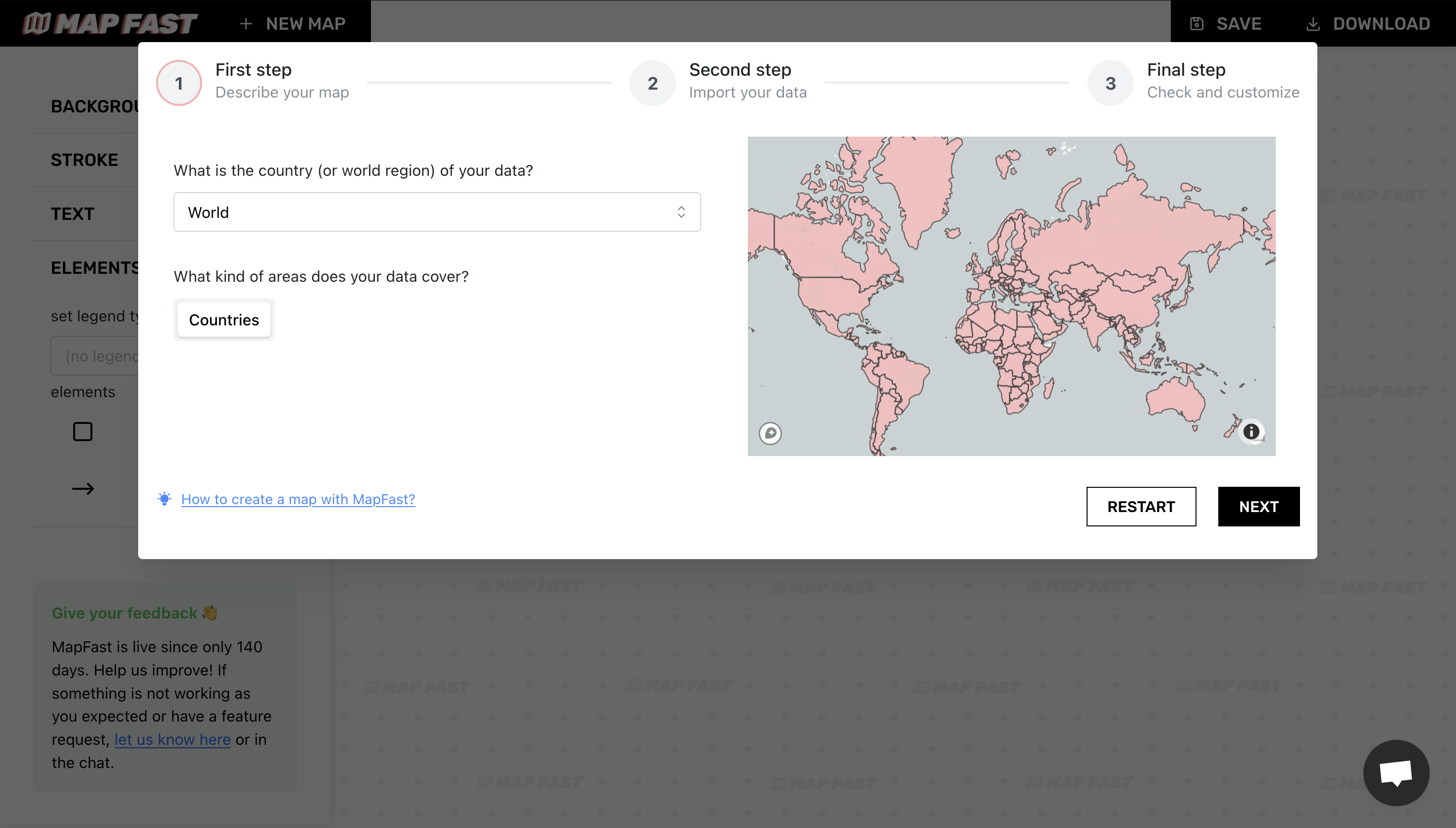
Now, let’s open the MapFast app and select “World” for the map area:
Once the preview map has loaded, we can upload our data by clicking the “Import Excel/CSV file” button. Once the upload is complete, you should be able to see the data in the table view on the right:
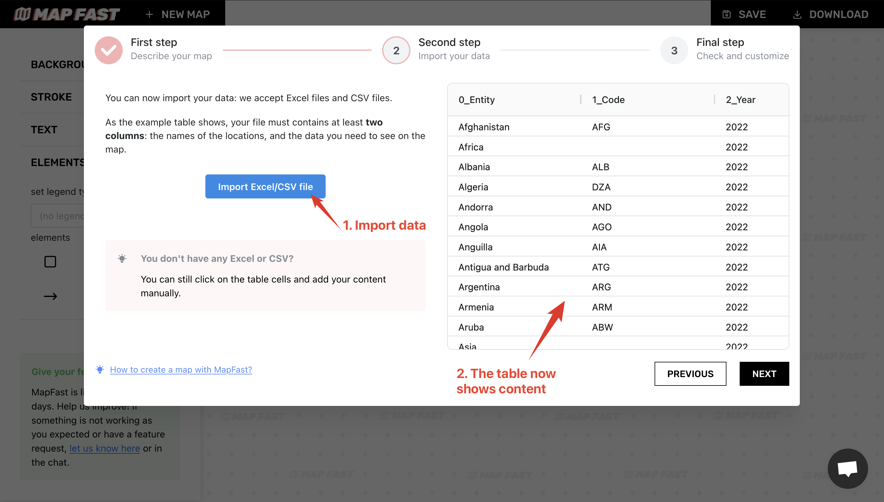
This view enables you to check that you have one row per location. This is a very important requirement. It doesn’t matter what the column names are in the imported file, but there must be a clear column containing the location, and only the location.
Review associations between rows and countries
At this point, MapFast will try to associate each row of the CSV file with a country from its database. Once finished, we need to review the matches, to be sure that everything will be displayed correctly.
After clicking “Next”, you’ll see a table with 2 columns: the first column contains locations from the CSV file we imported. The second one contains the country that was matched with the row. That’s what we need to check.
Most of the lines appear green, but some may show up red because no match has been found.. In our case, that’s normal : it is because our dataset contains aggregated values for ‘Asia’, ‘Europe’, etc.
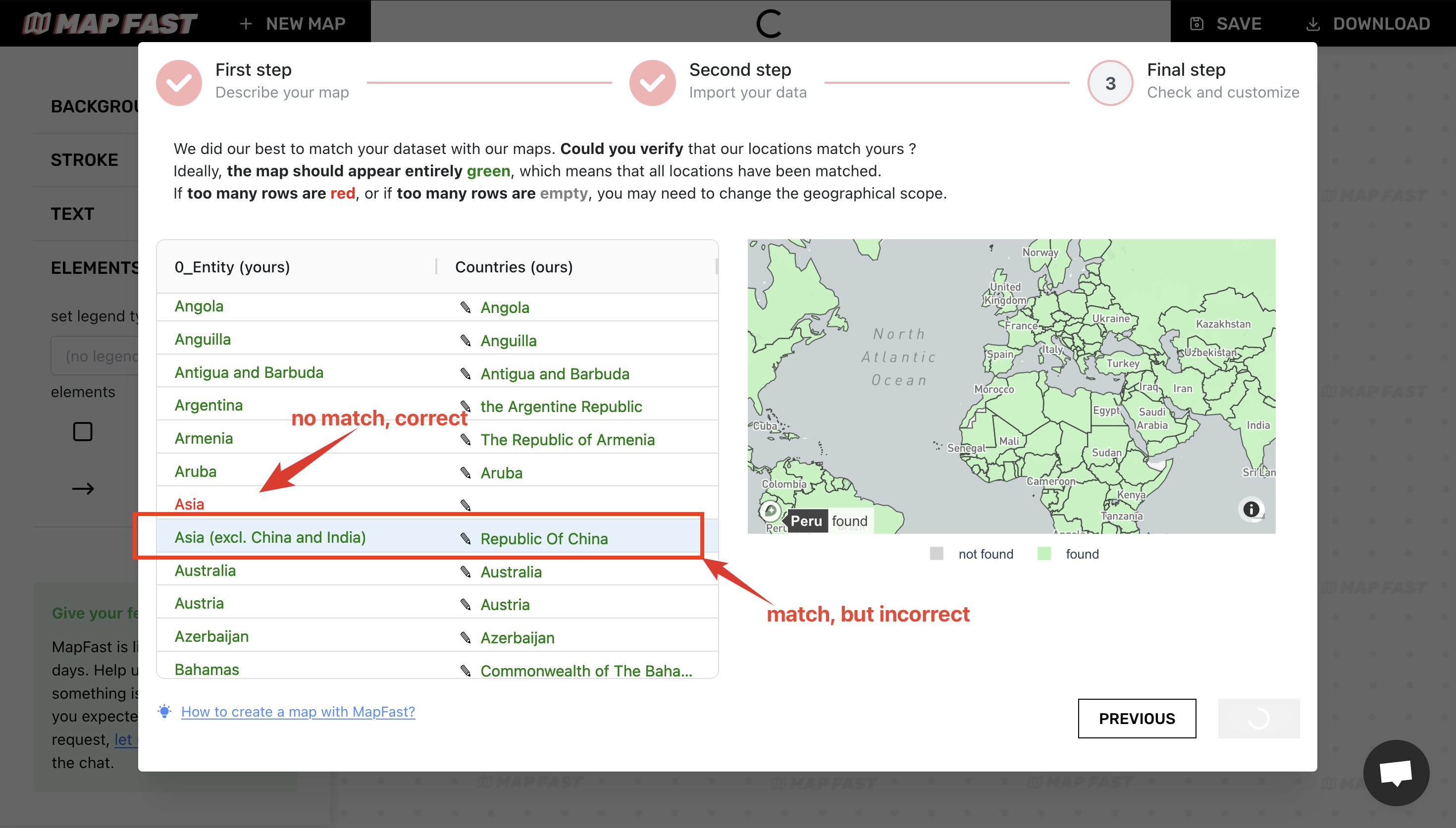
We also need to check green lines, because it might not be associated with the correct country. I found two cases :
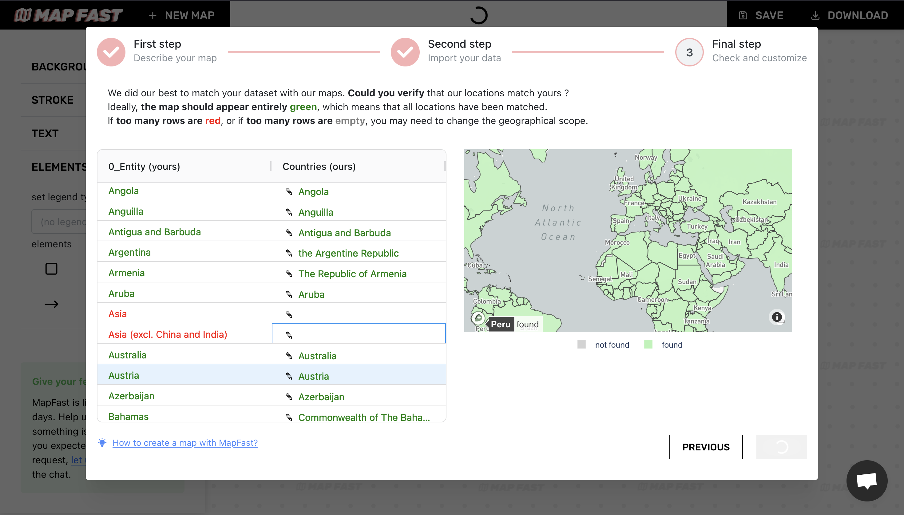
- ‘Asia (excl. China and India)’ incorrectly associated win ‘Republic of China’;
- ‘European Union (27)’ incorrectly associated to ‘Tokelau’.
To remove both associations, we can click on ‘Republic of China’ and remove the association by selecting the blank option. We do the same for ‘Tokelau’.
The map on the right shows the completeness of our data. If the map is entirely green, it means we’ve covered the entire world. Good!
Map preview
The last step is really straightforward: we just need to pick the data column. In our case, it’s ‘Annual CO2 emissions (per capita)’.
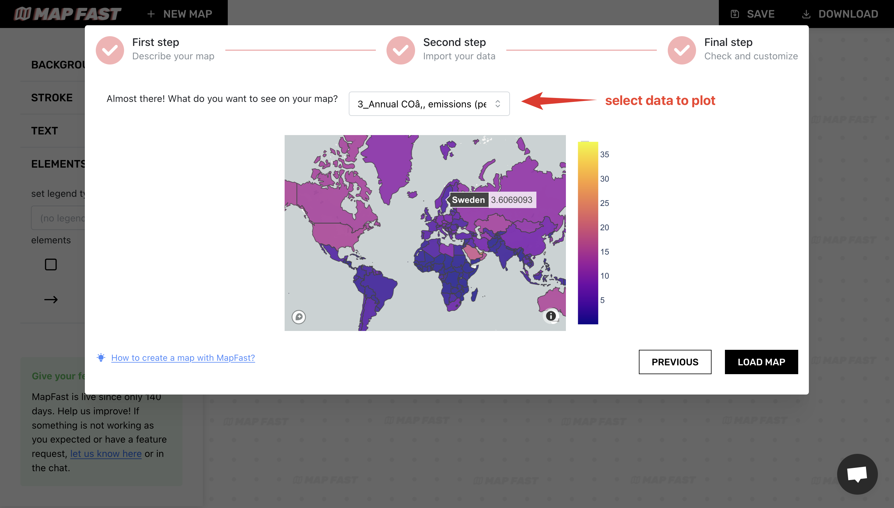
The map will show a preview of the data. We will customize its appearance afterward.
Click “Load map” when you are ready!
Customization
Once our map is loaded, we only need to customize it the way we want.
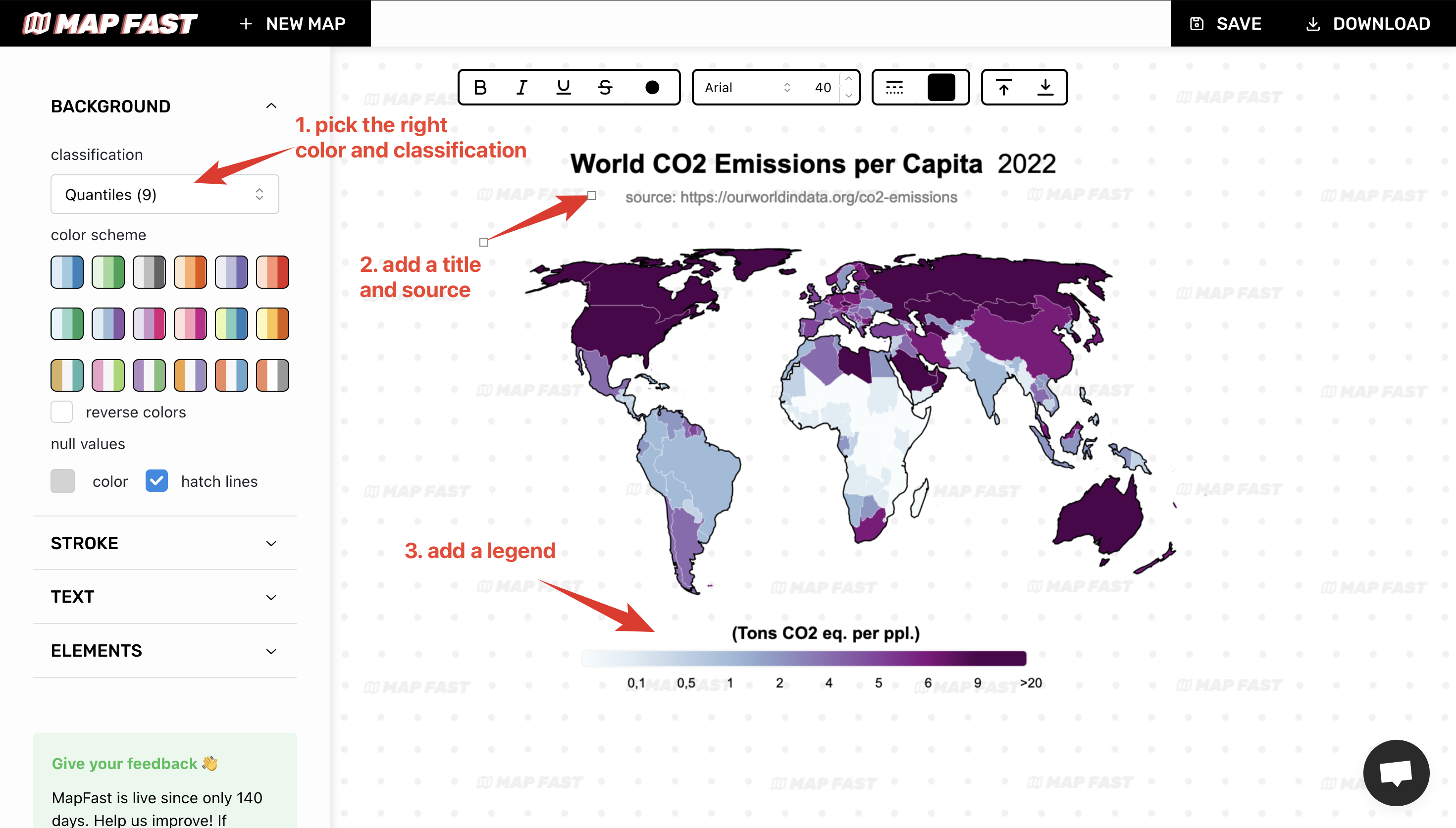
The basics are:
- Set the appropriate color and scheme. For more detailed color differentiation, I’ll pick ‘Quantiles 9’ (in-app: ‘Background > classification’).
- Add map title and source. It is very important to add context to a map, that gives credibility. I’ll go for “World CO2 Emissions per Capita, 2022” and cite “Our World in Data” (in-app : ‘Text > Title’ and ‘Text > Source’).
- Add legend. The legend is an absolute necessity if values are not properly displayed on the map. I chose a horizontal legend since the map is horizontal (in-app: ‘Elements > Legend > Continuous Horizontal’). I also adjusted the text values.
Final result
That’s it! You now have a beautiful world map. 🙂
You can export it using the “Download” button as a PNG or SVG with the resolution that you need.
Happy mapping 🤩