A guide to Choropleth Maps
Have you ever glanced at a colorful map and immediately grasped which regions were wealthier, more densely populated, or facing unique challenges? Chances are, you were looking at a choropleth map.
These maps use color shading to represent data across specific areas—like population density, unemployment rates, or even levels of internet access—making complex data instantly understandable.
Source: How to make a World map
In this guide, you will learn how choropleth maps are made and their strengths and weaknesses. Let’s go!
What are choropleth maps used for?
Choropleth map definition is “a map which uses differences in shading, coloring, or the placing of symbols within predefined areas to indicate the average values of a particular quantity in those areas.”
Said differently, choropleth maps are a visual storytelling tool for geographical data. They can be applied to any domain, but they are frequently used in Politics, Economics, Public Health and Real Estate. They are also easy to read and understand, if made correctly.
Let’s look at some common examples 🙂
Politics
Choropleth maps can be used show political patterns across regions, making it easy to see where support for different parties is strongest and how demographics influence voting trends.
Here is an example from the 2020 U.S. Presidential Election :
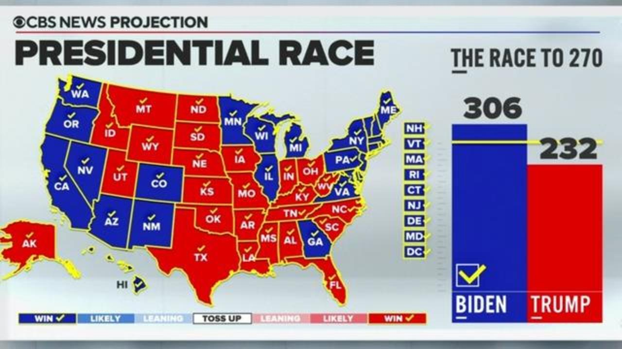
This map provides a quick overview of which states voted for the Democrats (in blue) and Republicans (in red). The use of each party's signature color enhances the map's clarity, making it easy to see which states supported each candidate and identify regional voting patterns.
However, political maps like this can be misleading, as they don’t account for the Electoral College system. Winning many small states may appear as a large area on the map but doesn’t necessarily lead to an electoral win.
In this case, the issue has been mitigated by CBS News with the addition of a bar chart to the map, as it complements the visual by showing each candidate’s actual electoral vote count and balancing this inherent bias.
Economics
Choropleth maps are powerful tools for visualizing economic data, as they use color shading to show variations across regions, such as income levels, unemployment rates, or GDP per capita.
In the context of economics, maps are not only used for communication but also for analysis. These type of visualizations are necessary for policymakers, economists and scientists to understand economic disparities and trends, and to communicate about them.
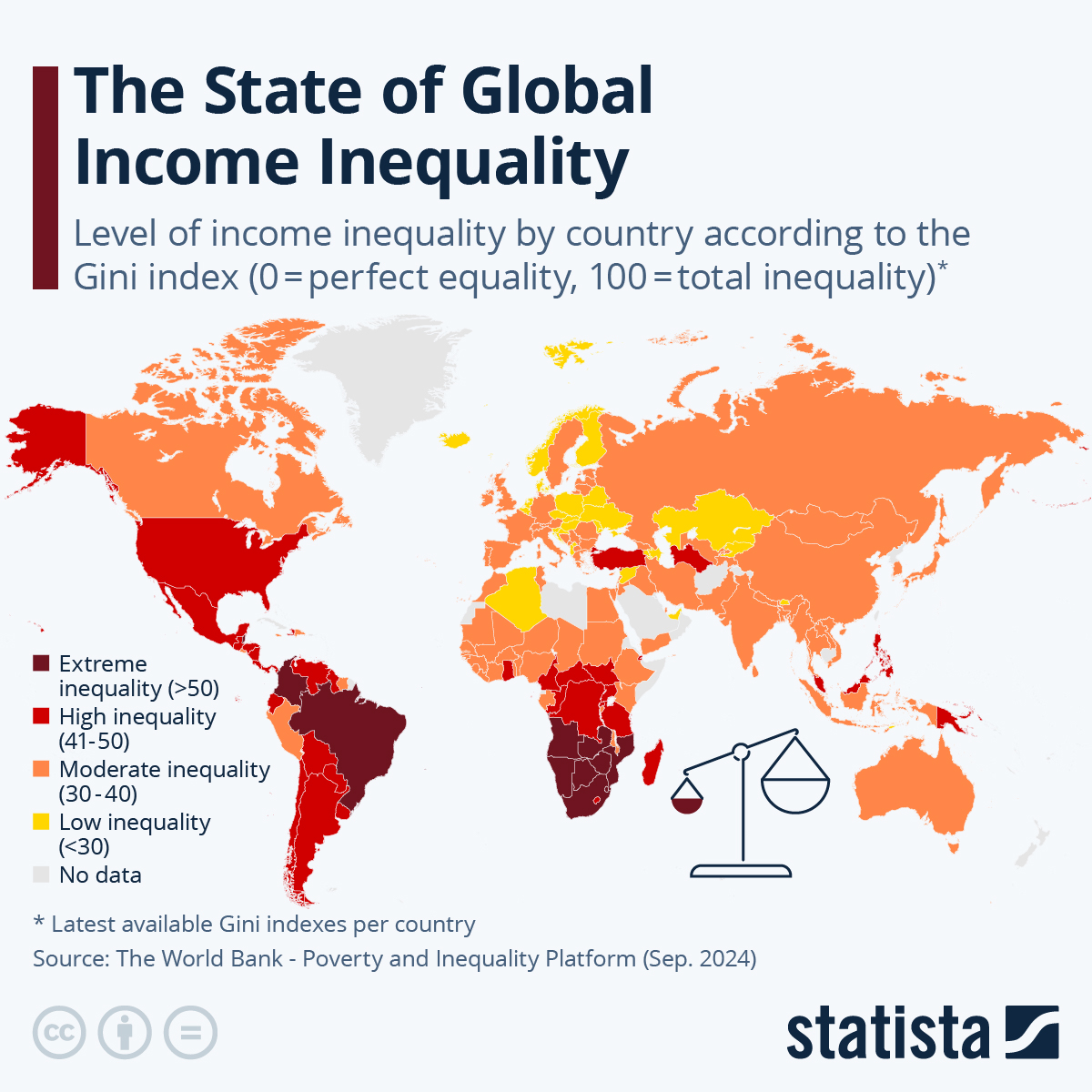
The above map successfully illustrates how a choropleth map can show regional patterns. The darker the red, the higher the inequality, making obvious to spot the highest values at a glance.
It’s fascinating how we can instantly see these global patterns—South America and Africa have some of the most intense inequalities, while Europe and parts of Asia present a more balanced income distribution.
However, the map does have its limitations. Smaller countries, like Luxembourg or island nations, are not shown due to their small size. Simplicity comes with some trade offs : adding all countries would certainly make this map more complex to read.
Public Health
Remember that strange time when we were all stuck at home, locked down? I’m sure you remember watching TV and seeing COVID-19 maps on every channel…
They helped us understand how the virus was spreading, whether globally or just in our local areas. Like political choropleth maps, these COVID maps became a part of our daily lives, essential for conveying quick, clear information to people around the world.
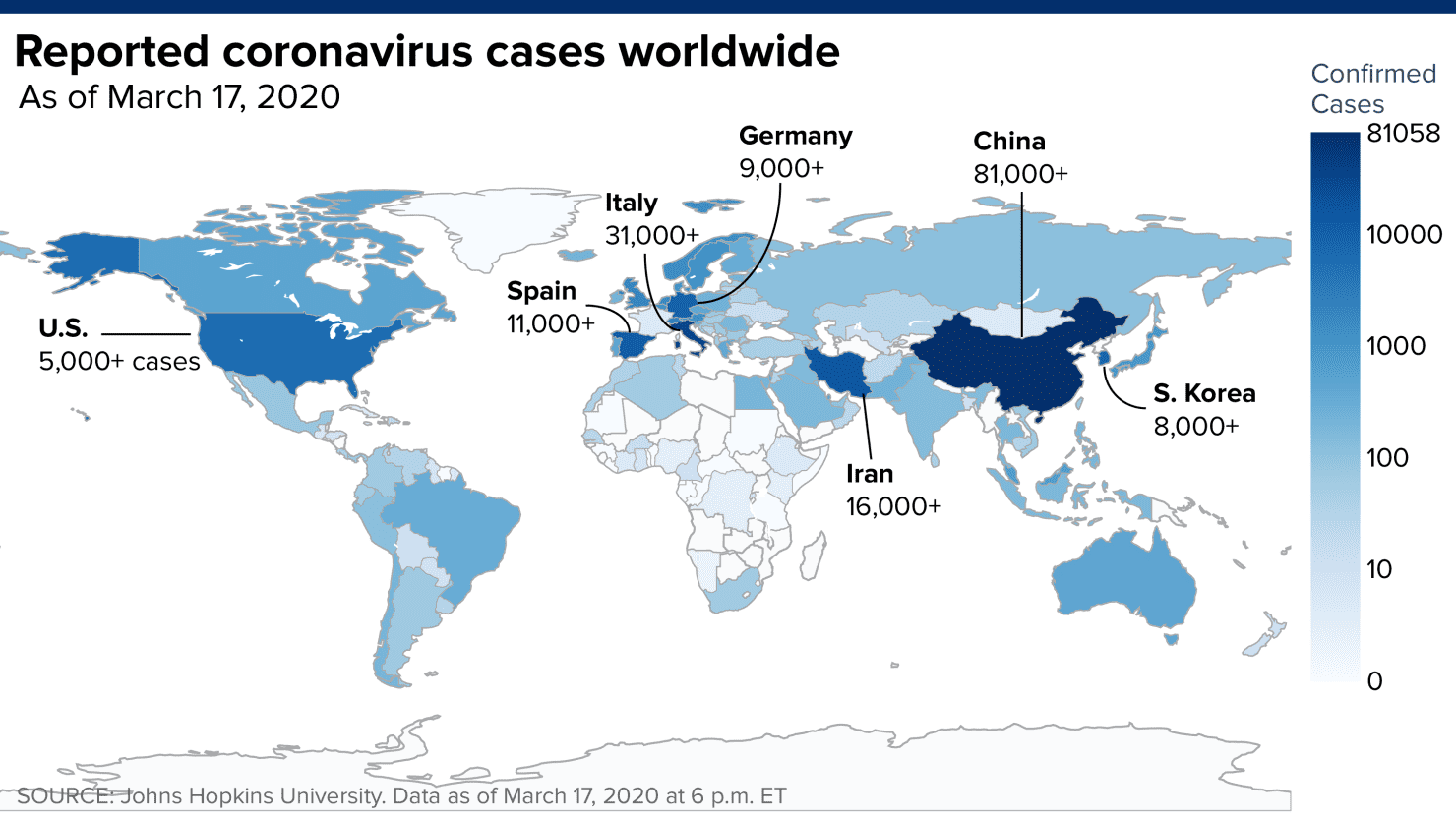
The above map shows the global spread of COVID-19 cases as of March 17, 2020, with darker blue shades indicating higher numbers of confirmed cases. At a glance, it highlights the initial hotspots of the pandemic—China, Italy, Iran, and South Korea—as well as emerging cases in the U.S. and parts of Europe.
You’ll notice that the legend is not linear, which is necessary because extremely high values, like China’s 81,000+ cases, would otherwise overshadow lower numbers. This scaling helps highlight variations across countries without letting the highest numbers dominate the map.
And many others…
You now got the idea. It is impossible to restrict choropleth maps to the 3 examples I cited above. Other well known includes real estate prices, demographic data, etc…
See also: How to make a colored map with MapFast
The importance of colors
Choosing the right color palette for a choropleth map is crucial to ensure patterns are clearly and easily identifiable by the viewer.
There are multiple choices :
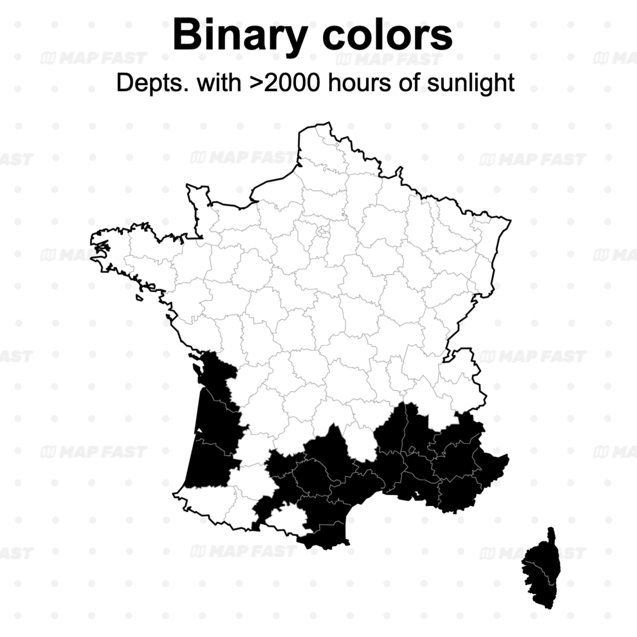
- Binary Colors: For two-category data, these colors provide a clear, high-contrast distinction between categories. Binary color schemes work well for yes/no, on/off, or binary classification data (like Democratic vs. Republican).
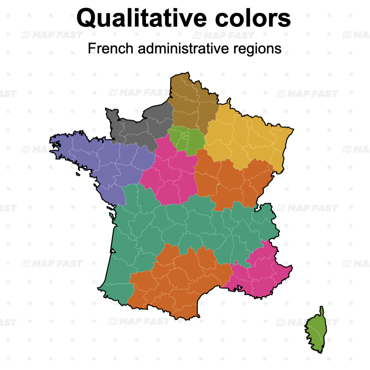
- Qualitative Colors: These colors work best for categorical data where there’s no intrinsic order or gradient. Each category gets a distinct color, ensuring clarity in differentiating categories like land use types or demographic groups.
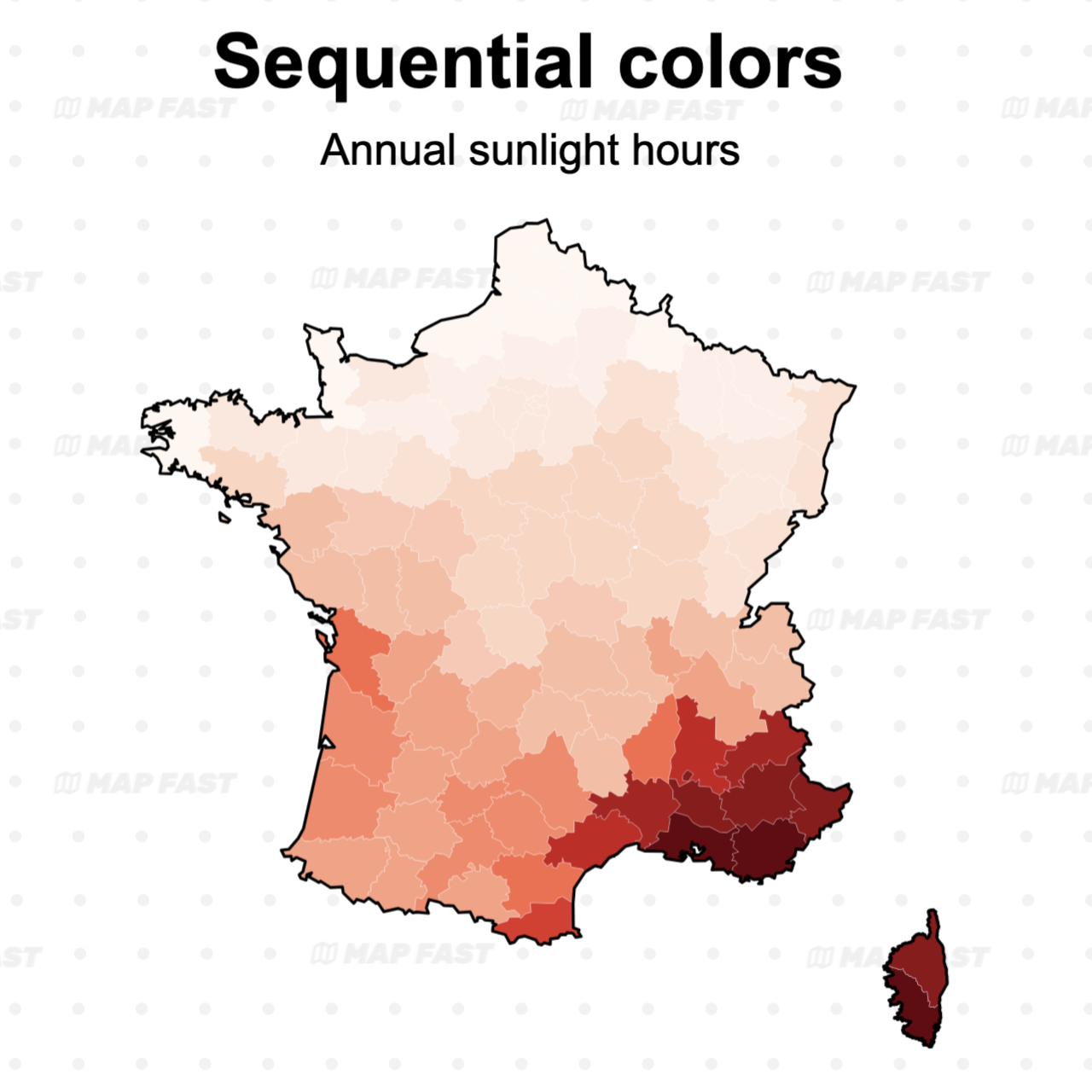
- Sequential Colors: Used for numeric or ordered data that moves in a single direction, often with a light-to-dark gradient. This is perfect for showing intensity, frequency, or amounts, such as population density or income levels.
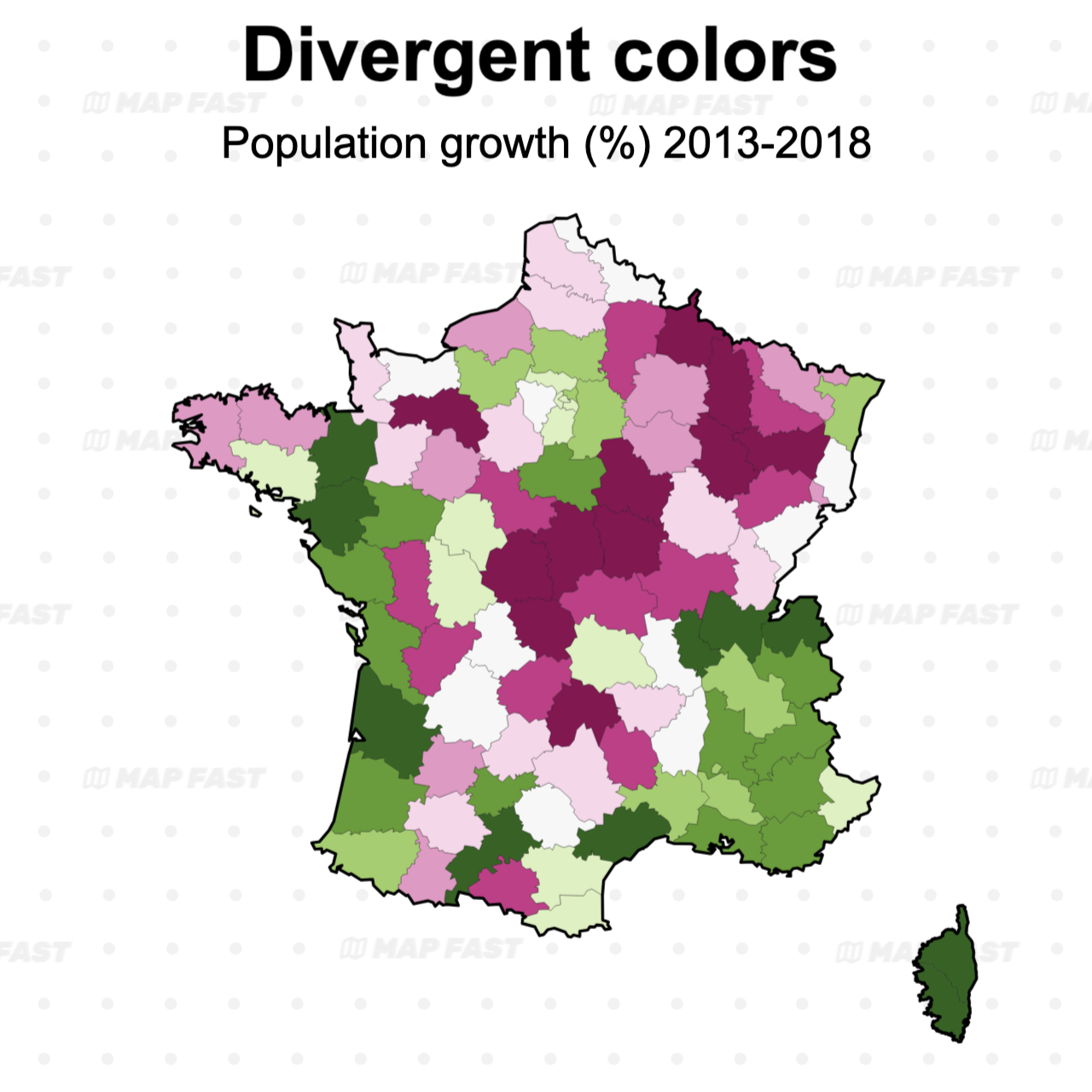
- Divergent Colors: These are ideal for data with a meaningful midpoint, like temperature changes or economic deviation. A divergent color scale uses two contrasting colors with a neutral midpoint (e.g., white, gray) to highlight values on either side of that midpoint.
Colors significantly influence perception. For instance, red can imply negativity, while green often suggests positivity. Darker shades typically represent higher values, while lighter shades indicate lower ones.
Misusing color can lead to viewer confusion, so careful selection is essential!
Learn more in this detailed article: how to choose colors for choropleth maps.
The importance of classification
Beyond color choice, the classification method—how values are grouped into categories or "steps"—plays a key role in shaping the map’s visual impact and readability.
Different methods like linear, quantiles, and Fisher-Jenks classification each affect how data is distributed across color gradients :
- Linear Classification (continuous): This approach applies a continuous color gradient across the entire range of data values, with each unique value mapped to a specific shade between the minimum and maximum. It works well for continuous data without clear clusters, providing a seamless transition in color across the range. However, it can be misleading in datasets with extreme values, as these outliers can dominate the color scale and obscure smaller variations, as seen in some COVID-19 maps.
- Quantile Classification: Here, each class contains an equal number of data points, creating a balanced visual distribution. This method is useful for highlighting relative differences, making it ideal for datasets with gradual but consistent variation. However, quantiles can exaggerate small differences if most values are close together, potentially overemphasizing minor variations as significant shifts in color.
- Fisher-Jenks Classification: This method groups data to minimize differences within each class, highlighting natural breaks in the data. Fisher-Jenks works well when there are clear clusters or gaps, giving a more accurate picture of patterns compared to linear or quantile methods. However, it leads to less intuitive steps harder to explain.
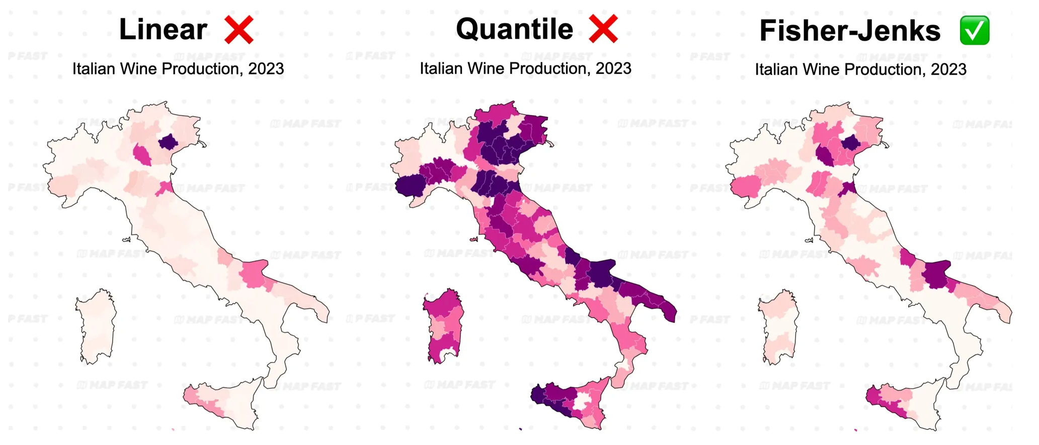
Illustration of the three classification methods : Linear, Quantile, Fisher-Jenks. For this data, Fisher-Jenks seem to be optimal.
In the above example, Fisher-Jenks seems the best option between Linear (highlights only extreme values) and Quantile (highlights too many small variations). At the end, it really depends on the data you have and the best is to try different options visually!
Learn more about classification methods in this article with example maps: Choosing the right Classification Method for your Choropleth Map
Why normalizing data matters
The most common error made with choropleth maps is to forget to normalize data. Normalizing data is the process to adjusting values to a common scale to ease comparisons.
For instance, you would normalize a “GDP per State” by the population per each state and obtain a “GDP per capita”. That way, you’ll effectively get a picture of the states that have the highest standard of living, instead of the states that have the largest population.
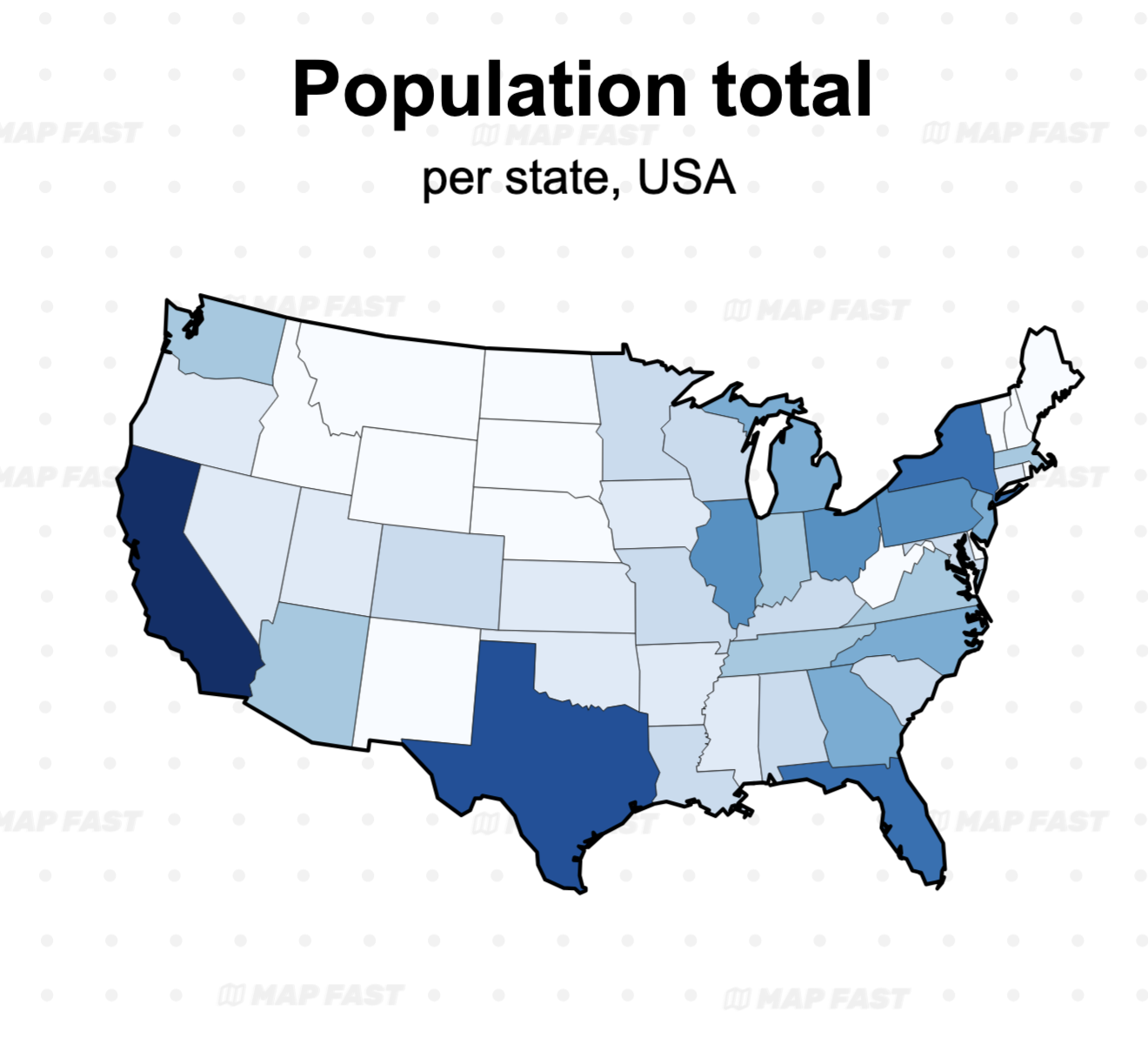
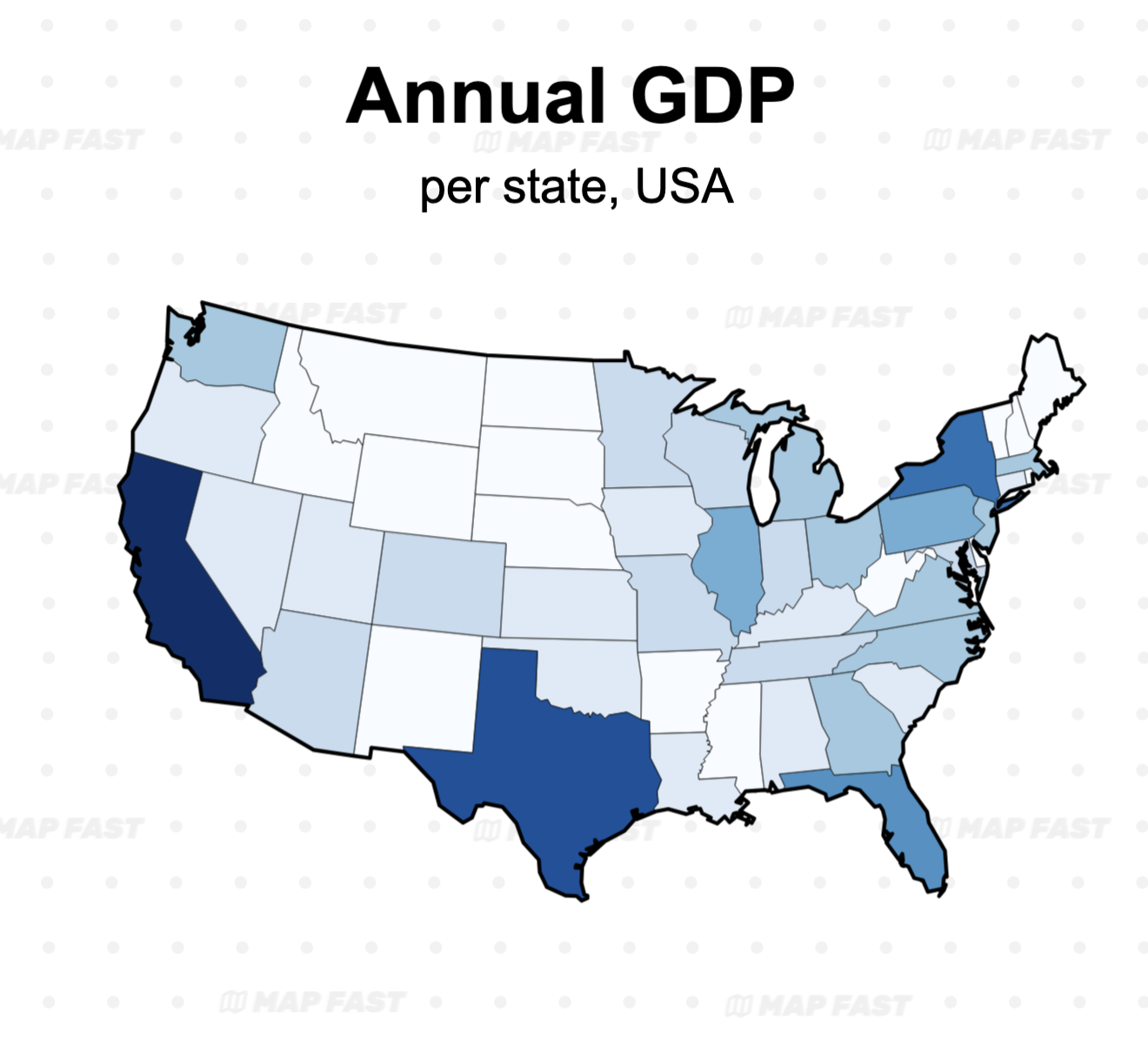
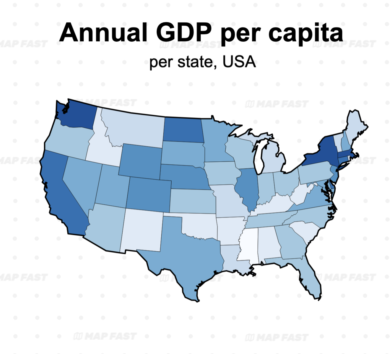
Notice how the “Population per State” map and “Total GDP per State” map are similar. On the other side, the per capita, normalized, map is showing a complete other reality.
Normalizing per capita (population count) is the most common. But it is not the only possibility and the choice must be done regarding the data you plot on map.
Here are other examples:
| Original | Normalized | How? |
|---|---|---|
| Total Income by State | Median Income per household | per household normalization |
| COVID-19 Cases by Country | COVID-19 Cases per 100,000 people | per capita normalization |
| Electric Vehicles Count per City | Share of Electric Vehicles count per City | total vehicles count normalization |
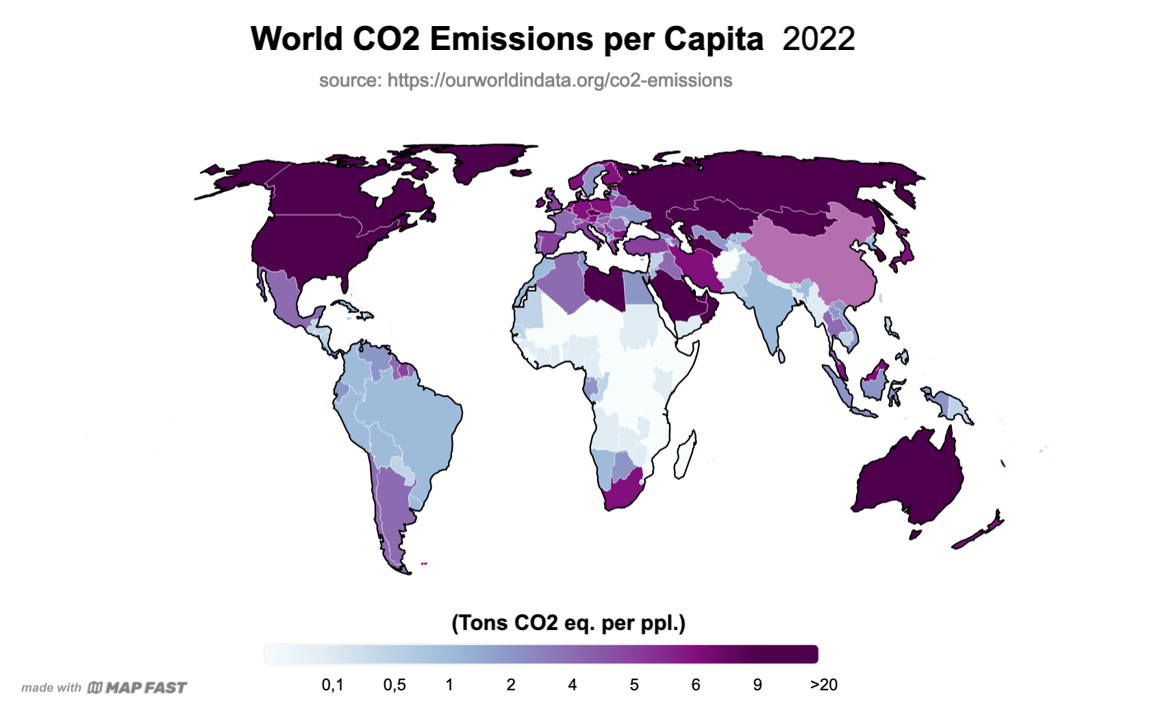
| CO2 Emissions by State | CO2 Emissions by State per km2 | per area normalization |
Sometimes you don’t necessarily need normalization. For example “Wine Production per Region” can be normalized as “Share of Wine production per Region”, but the wine production counts are not likely to be the same as the population counts anyway. In this case, you have the possibility to make two different maps but complementary maps.
Learn more about normalization : Why choropleth maps need normalization, coming soon
Pros and cons of Choropleth Maps
Like everything in life, choropleth maps come with their strengths and weaknesses:
→ Pros:
- ✅ Intuitive: Anybody can understand maps because of their visual aspect. They are more intelligible than raw numbers or bar charts for geographical data.
- ✅ Great for comparison: They’re awesome for comparing different regions at a glance. They allow discovering regional patterns that could not be seen using other types of graphs (e.g. a bar chart).
- ✅ Multi-purpose: They can be used for season statisticians driving insights or marketers using them as a communication medium. They are useful for both analysis and communication.
→ Cons:
- ❌ Prone to bias: Different colors and classification scheme can produce different maps, telling different stories. Adding to this the frequent need for normalization, maps can be easily made incorrectly or convey the wrong message.
- ❌ Big areas can mislead: Take Australia, for example. It might dominate visually on a world map, but population-wise, it’s mostly empty. So, choropleth maps can make low-data areas seem more important than they are. Different earth projections may also amplify this effect.
- ❌ Boundaries matter: There are many ways to represent geographic areas : political borders, cultural borders, naturals borders. Many areas are disputed. At the end, there are a lot of choices to do and it might not please everybody.
Wrapping It Up
Choropleth maps are an incredible tool for visually communicating geographic data. Just make sure to normalize your data, choose your colors carefully, and you’ll be on your way to creating insightful, visually appealing maps that tell a true story. 🙂
The good news is, we created a lot of resources to help you create meaningful maps with MapFast!
You should take a look at :
- How to make a World map / How to make a Europe map
- How to make a binary map (coming soon)
- Why maps require normalization (coming soon)
- Choosing the right Classification Method for your Choropleth Map
⭐ Happy mapping ⭐