How to create a map with MapFast?
Have you ever dreamed of creating a colored map to showcase statistics and analytics but never knew where to start? I understand—it’s complicated. But you're in the right place now!
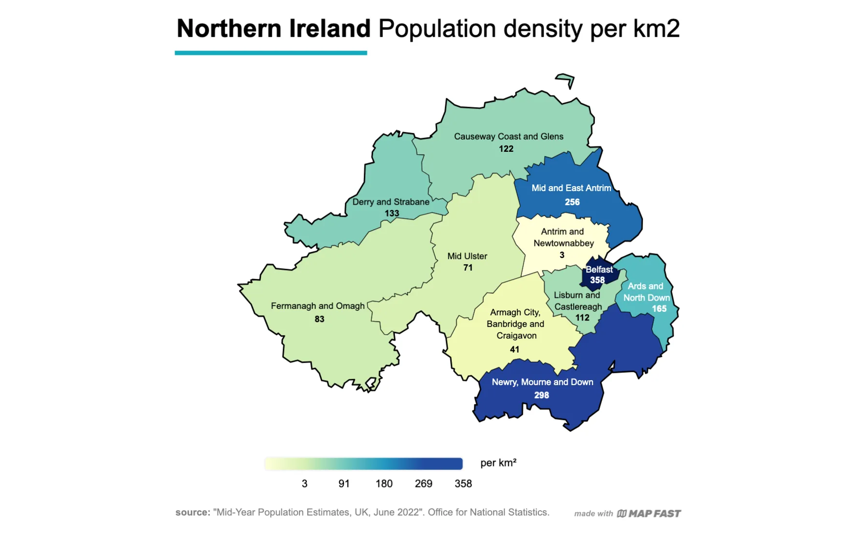
The example map we will build in this tutorial.
This tutorial will help you to create your own map in 5 steps:
Learn more on color-coded (choropleth) maps: A guide to Choropleth Maps
1. Pick the region or country
First things first, you need to specify either the country or the region that represents the context of your data.
You will have two choices:
- Countries: USA, India, France, United Kingdom, Tuvalu... you can choose between 200 available countries.
- World areas: North America, South America, Europe, Asia, Oceania are available. You can also pick "world" to create a World Map by countries.
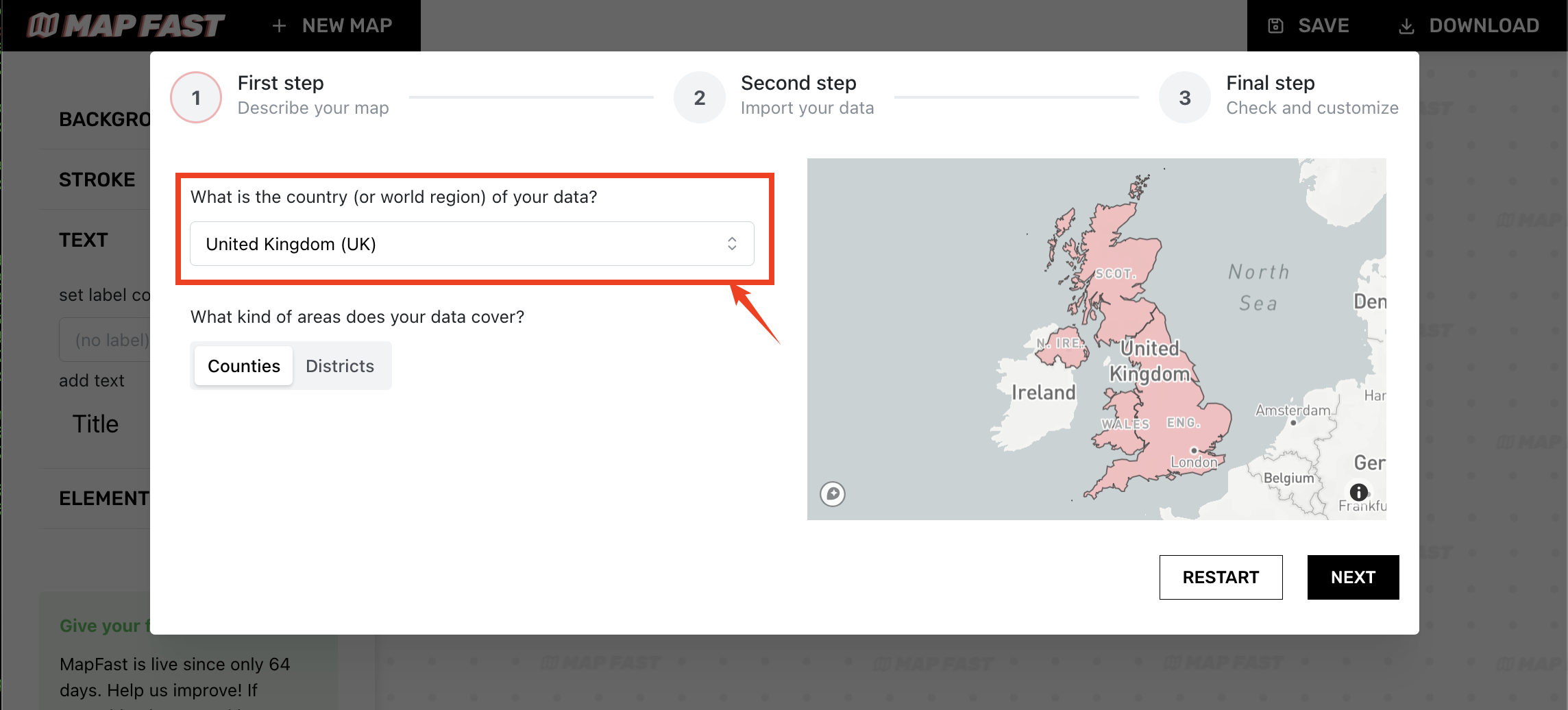
Once you've picked a country or region, you can choose the type of areas your data will cover. Usually, you'll have administrative boundaries: regions, provinces, districts, or municipalities.
At this step, the choice needs to closely reflect your data. If you want to display every municipality in a country, you will need to have a dataset where each row represents a city.
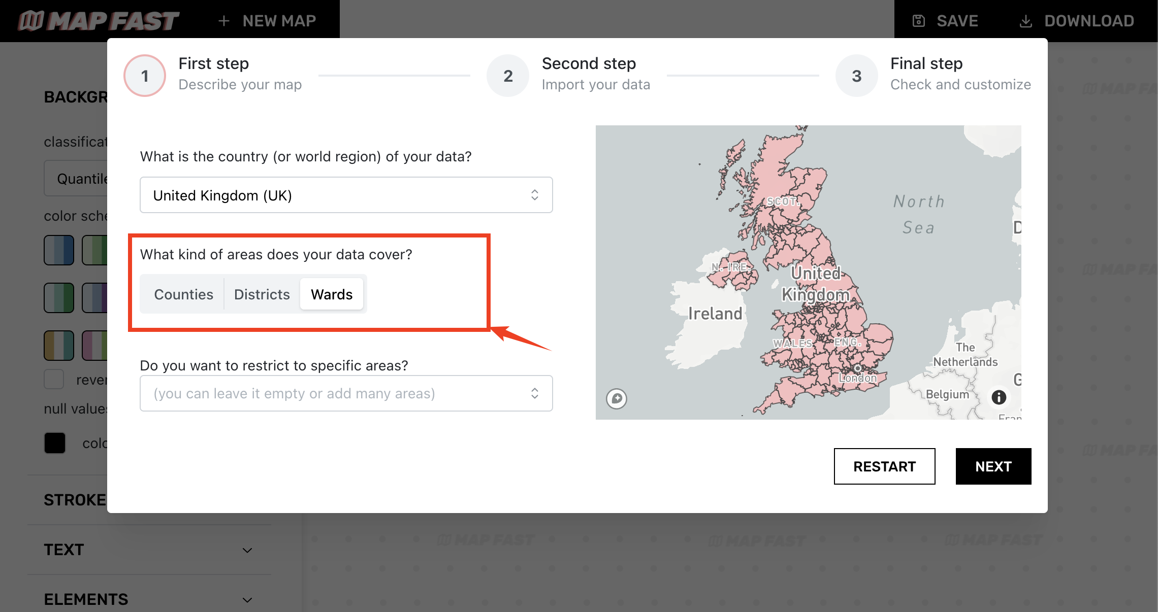
Finally, you can narrow it down to a specific subset area, allowing you to focus on a particular part of the country or region that you selected.
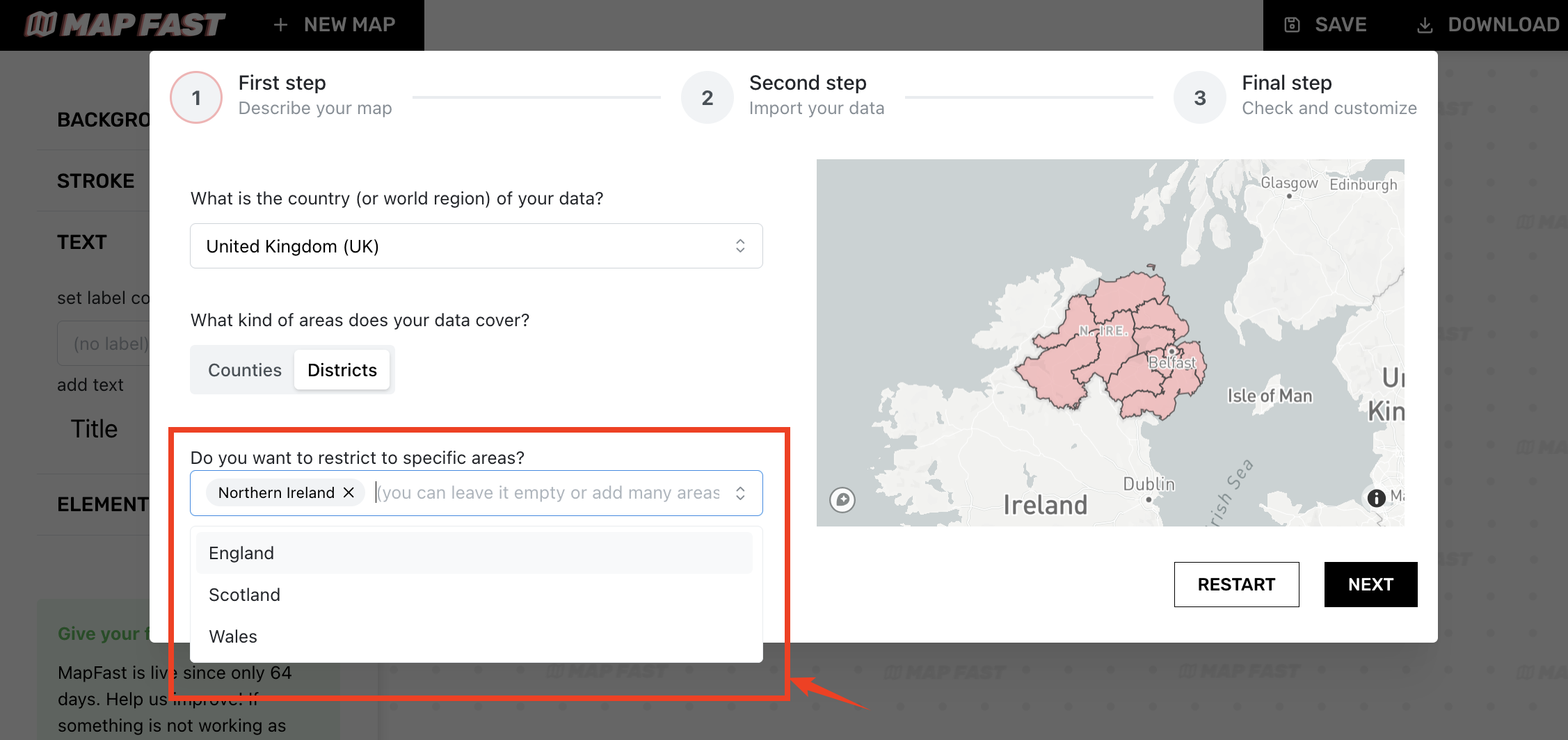
It can also be left empty, even if you don’t have all the data for all the areas on the map. You’ll still be able to remove it later.
2. Import your data (or edit manually)
It's usually more convenient to have an Excel or CSV file for your data, especially if you have many values to display on the map. For instance, France has over 35,000 cities… nobody wants to map them all by hand!
But if you don’t, you can still manually update the table and fill it with your own values.
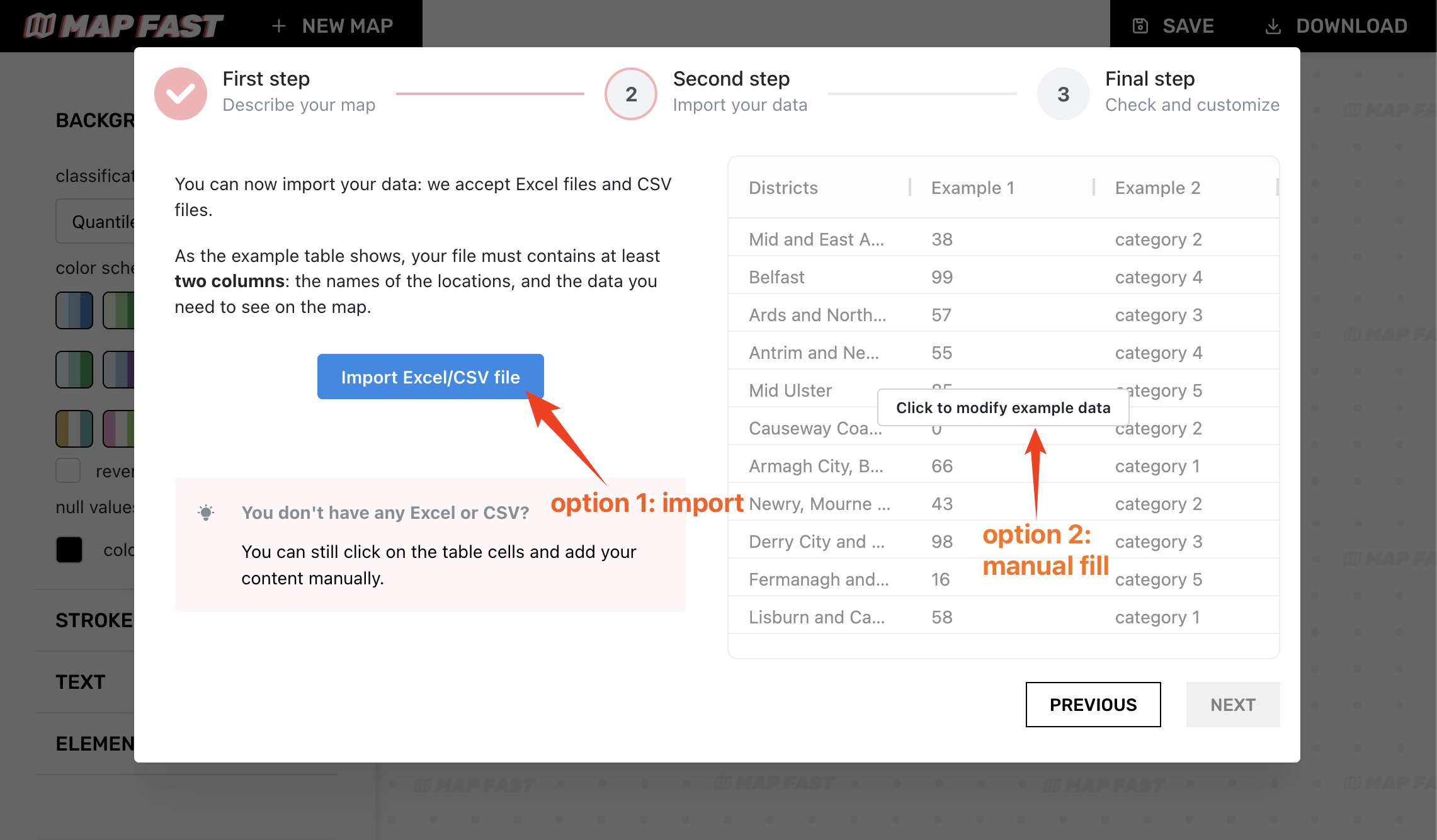
This part is the most important part : to ease the creation of the map, your file should at least contain two columns:
- the "location" column: It must contain the list of the names for each area that will be added on the map. E.g., the name for each city if you chose "municipality" previously.
- the "data" column: It can be either numbers (ex: GPD, sales, or % values) or categorical data (e.g Fruits, Brands, etc.)
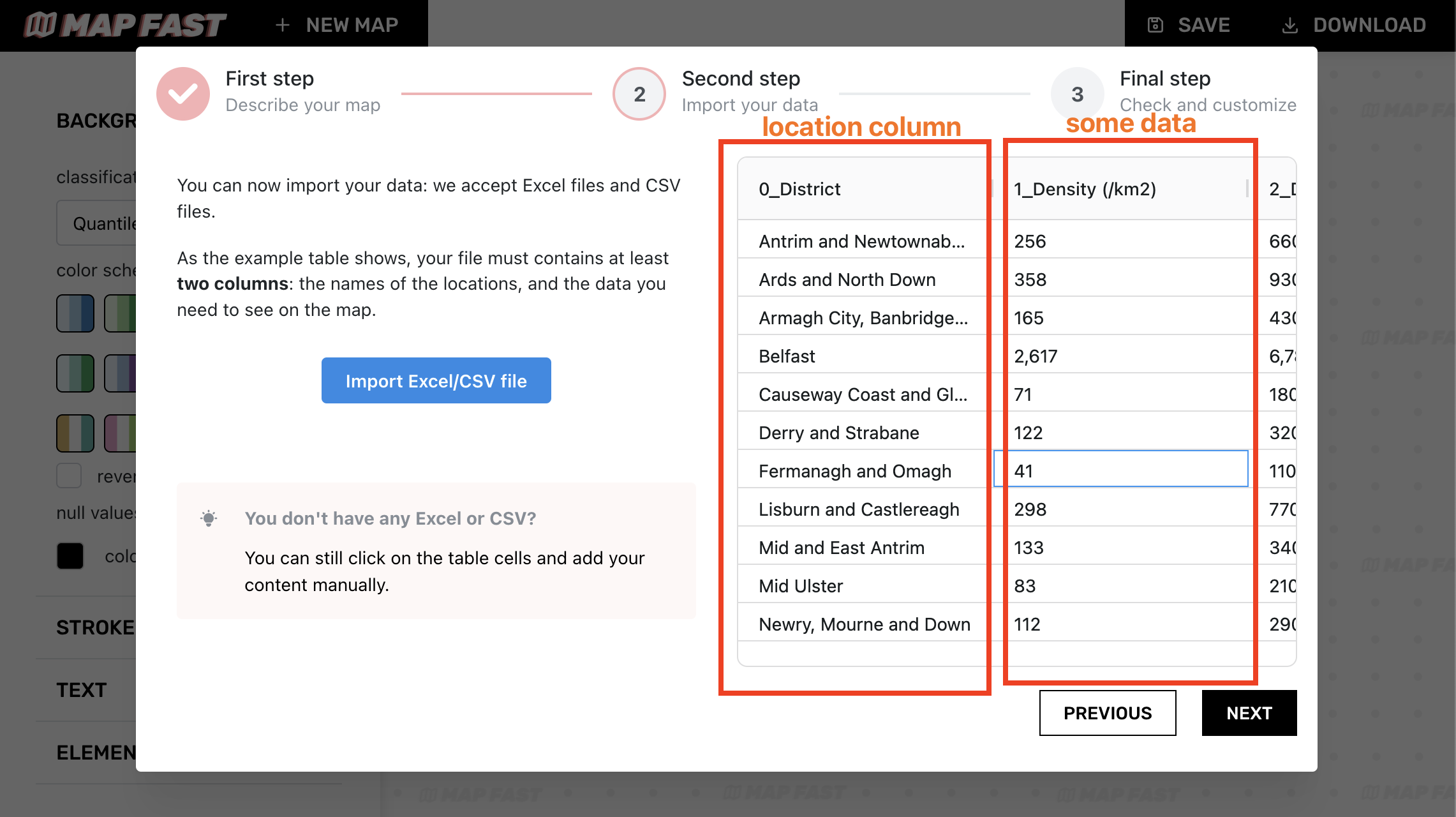
- you don't need to name these columns specifically. The location column will be detected, and you'll be able to choose the data column
- you can click on the table and edit the data if needed
Overall, you will minimize import errors if…
✅ Each row of your dataset is consistent with the type of data you chose in step 1 (e.g. each row is a city of you selected cities).
✅ Each line is a unique location.
✅ Remove unnecessary (or blank) lines or columns in your dataset.
After importing your data, you should see it inside the table. You can still click on cells to modify the content to fix some errors you haven't noticed before.
3. Check matching and pre-visualize
Behind the scenes, MapFast associates each row of your dataset with a geometry (a polygon on the map). This crucial step is called the “matching“, between textual locations and their respective representation on a map.
MapFast does this automatically for you, but you can still check that every match is correct. In this case, you can click on a row and add/modify the associated location, or remove it by setting the line to blank.
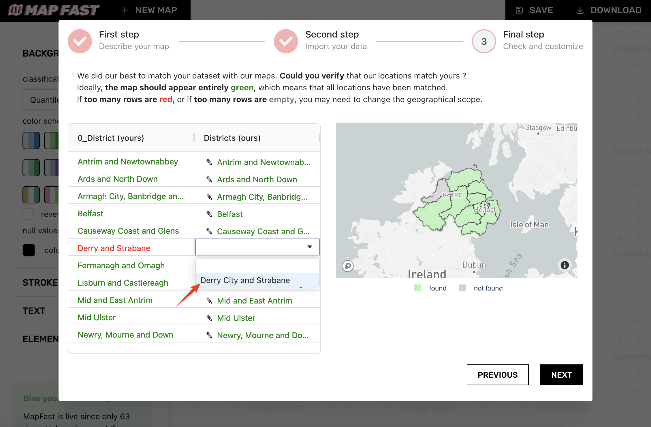
The map on the right will show all areas in green that have been associated with your data. Usually, the greener the better! But as mentioned earlier, it's okay if there are a lot of gray areas if your data only concerns a subset of the country or region.
Once you double-checked the matching, you can choose the data to see on the map. Select between all the columns of your dataset.
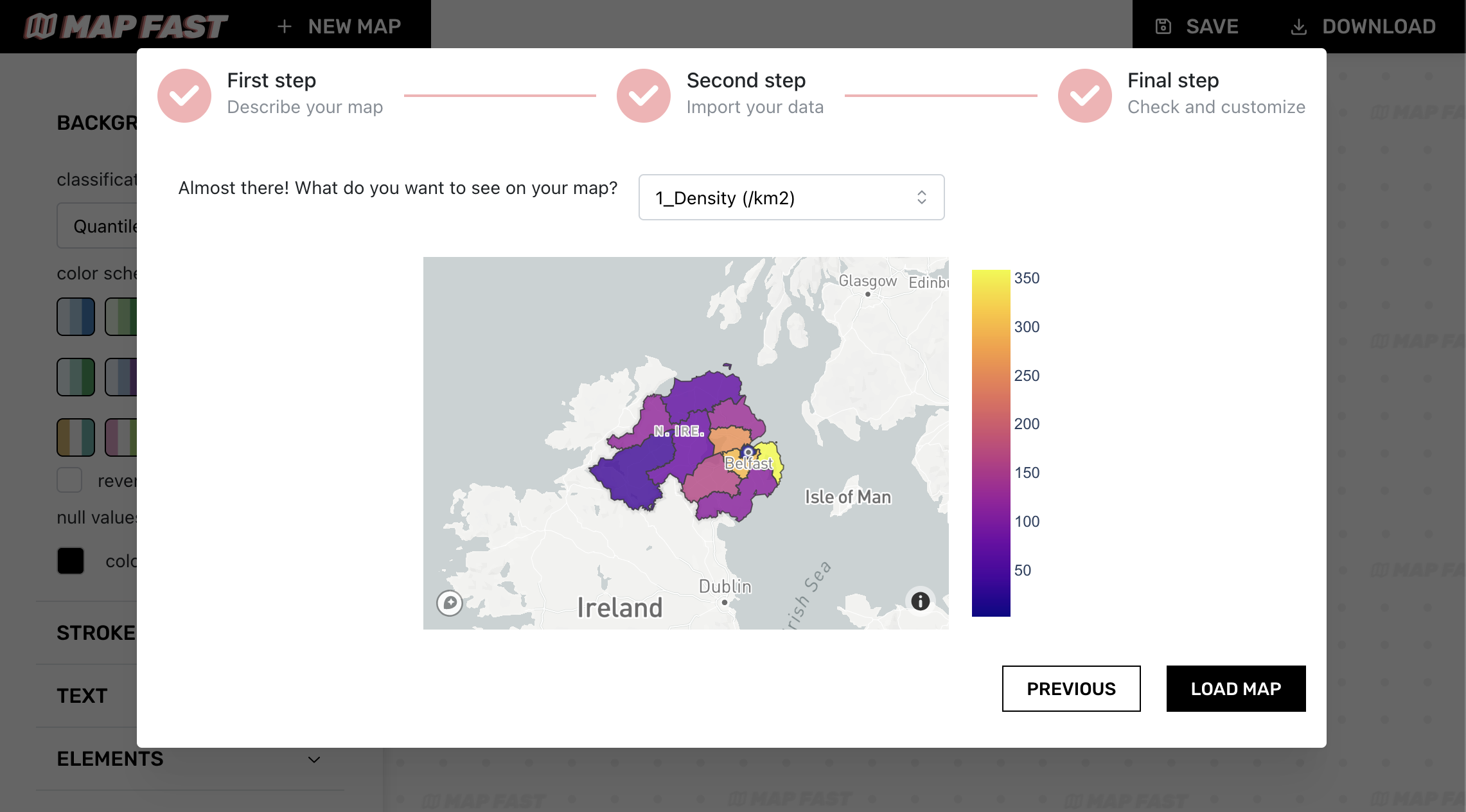
The map helps us be confident that all values are consistent. It will show you what to expect, in case you want to go back and modify some values.
4. Customize map
Here we are! Now we are in the most interesting part: customizing the map.
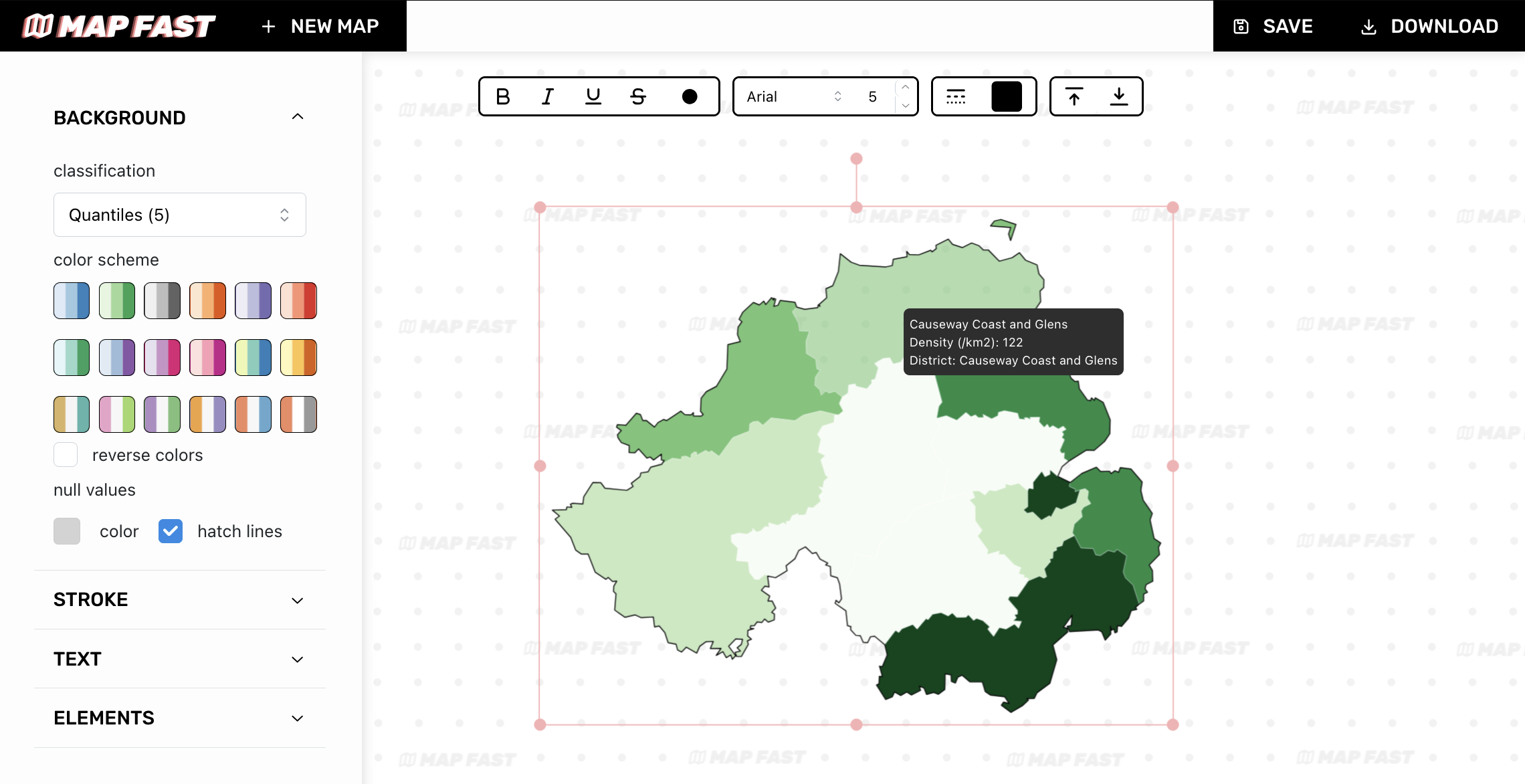
You have several options in the sidebar :
- background: adjust the colors and how to match colors with values (color scheme). You can also set the color for null values.
- stroke : change inside and outside stroke width and color ;
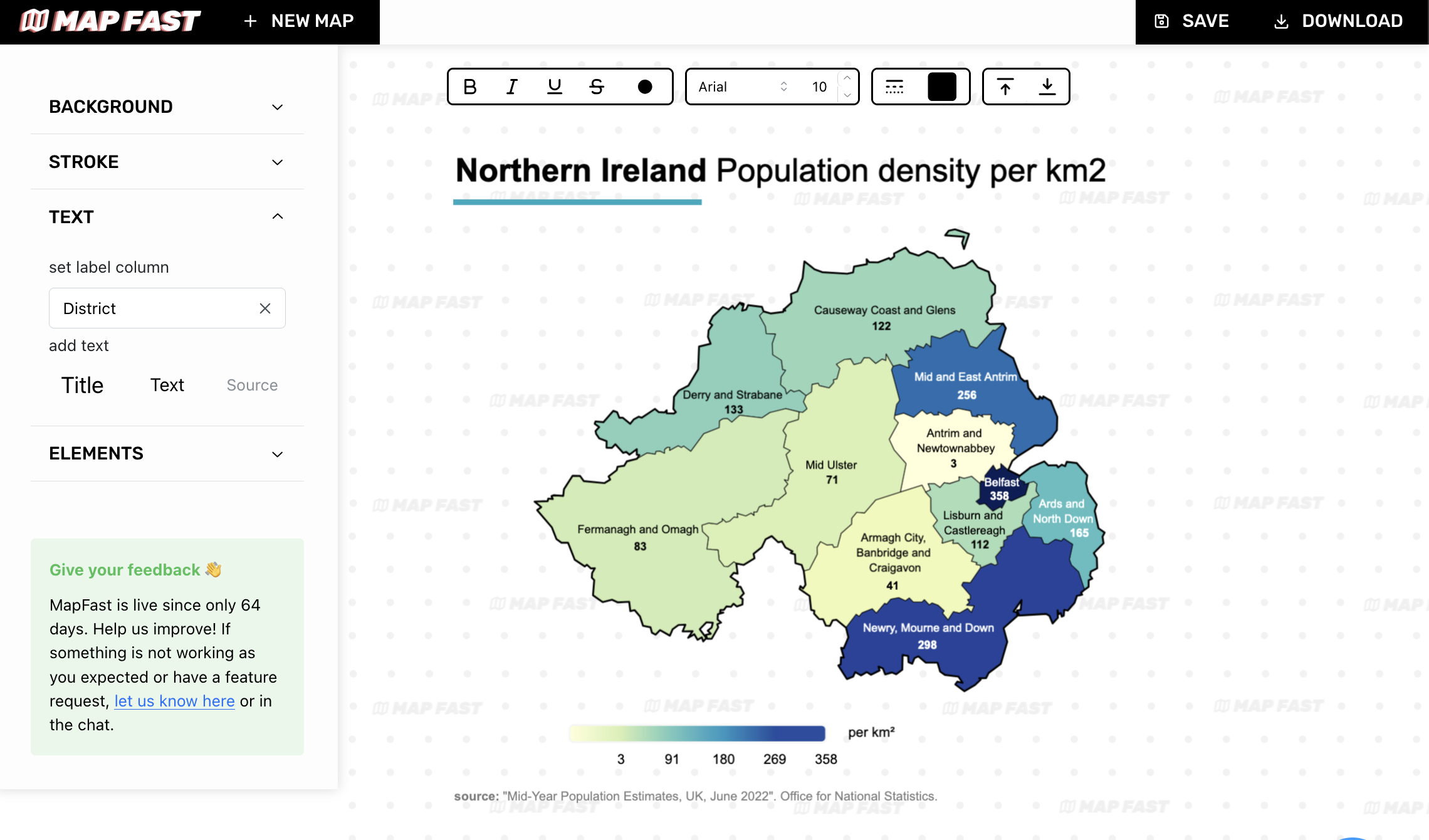
- text : add free floating text and labels on the map.
- elements : add rectangles, lines to highlight parts of your map. You can also add a legend from this menu.
5. Export your data
Now that you have a beautiful map, it's time to share it to the world. Or internally, to your fellow colleagues. Or just for you (maybe making maps is your guilty pleasure…).
You have two export options: PNG and SVG. The latter is useful if you need to open the map in more advanced software, like Illustrator or Inkscape.
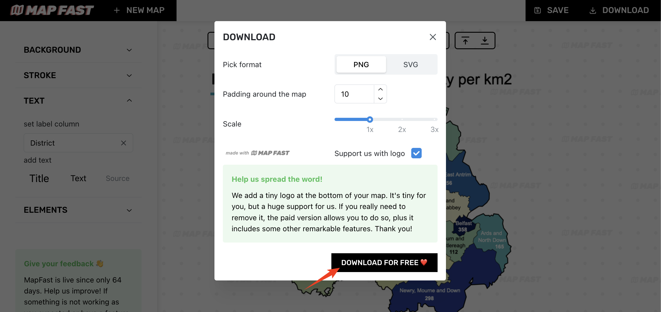
At this point, you can freely download your map and enjoy the final result:
Northern Ireland, Population density per km2 in June 2022. That’s it!
I hope this tutorial helped you create your first map !
Explore our other ressources:
You can also send us a message directly in the app for any question.
⭐ Happy mapping! ⭐