How to create map of Mexico with MapFast?
The goal is to create a map of Mexico with a population dataset.
We will see two types of maps:
- scatter plot: best when you have addresses or coordinates (e.g., a list of cities or customers)
- choropleth: best when you have region-level stats and want to provide easy comparison
Here, we will create both so that you can see the difference between the two types of maps.
Step 1: Upload your data
Create an Excel file or CSV file with at least two columns:
- The names of the regions (e.g., Aguascalientes, Baja California, Baja California Sur)
- The values you want to display on the map (e.g., the population, the GDP, etc.)
You can name the columns as you want, it doesn't matter.
Here is an example, the population data for Mexico (2020):
| 0_geo_name | 1_year | 2_value |
|---|---|---|
| Aguascalientes | 2020 | 1425607 |
| Baja California | 2020 | 3769020 |
| Baja California Sur | 2020 | 798447 |
| Campeche | 2020 | 928363 |
| Chiapas | 2020 | 5543828 |
| Chihuahua | 2020 | 3741869 |
| Coahuila de Zaragoza | 2020 | 3146771 |
| Colima | 2020 | 731391 |
| Distrito Federal | 2020 | 9209944 |
| Durango | 2020 | 1832650 |
| Estado de Mexico | 2020 | 16992418 |
| Guanajuato | 2020 | 6166934 |
| Guerrero | 2020 | 3540685 |
| Hidalgo | 2020 | 3082841 |
| Jalisco | 2020 | 8348151 |
| Michoacan de Ocampo | 2020 | 4748846 |
| Morelos | 2020 | 1971520 |
| Nayarit | 2020 | 1235456 |
| Nuevo Leon | 2020 | 5784442 |
| Oaxaca | 2020 | 4132148 |
| Puebla | 2020 | 6583278 |
| Queretaro de Arteaga | 2020 | 2368467 |
| Quintana Roo | 2020 | 1857985 |
| San Luis Potosi | 2020 | 2822255 |
| Sinaloa | 2020 | 3026943 |
| Sonora | 2020 | 2944840 |
| Tabasco | 2020 | 2402598 |
| Tamaulipas | 2020 | 3527735 |
| Tlaxcala | 2020 | 1342977 |
| Veracruz de Ignacio de la Llave | 2020 | 8062579 |
| Yucatan | 2020 | 2320898 |
| Zacatecas | 2020 | 1622138 |
Then, just open the MapFast app and drop your data in the upload section.
That's it! The app will automatically detect the boundary names and create a map of Mexico with your data. Once finished, it should look like this:
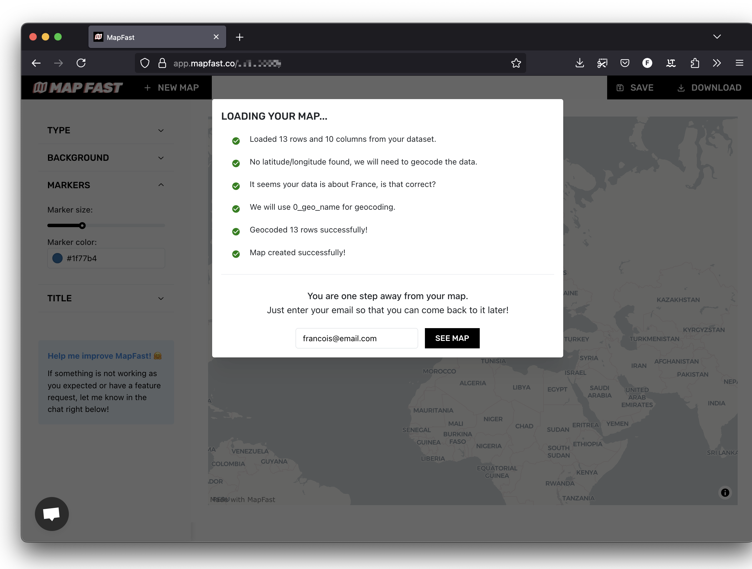
Fill in your email and click on "See map".
Step 2: customize your map
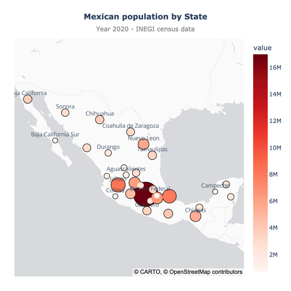
Scatter map
By default, the app will create a scatter map of your data. Here is what it looks like for the population as the size (1) and color (2) of the markers, and a title (3):
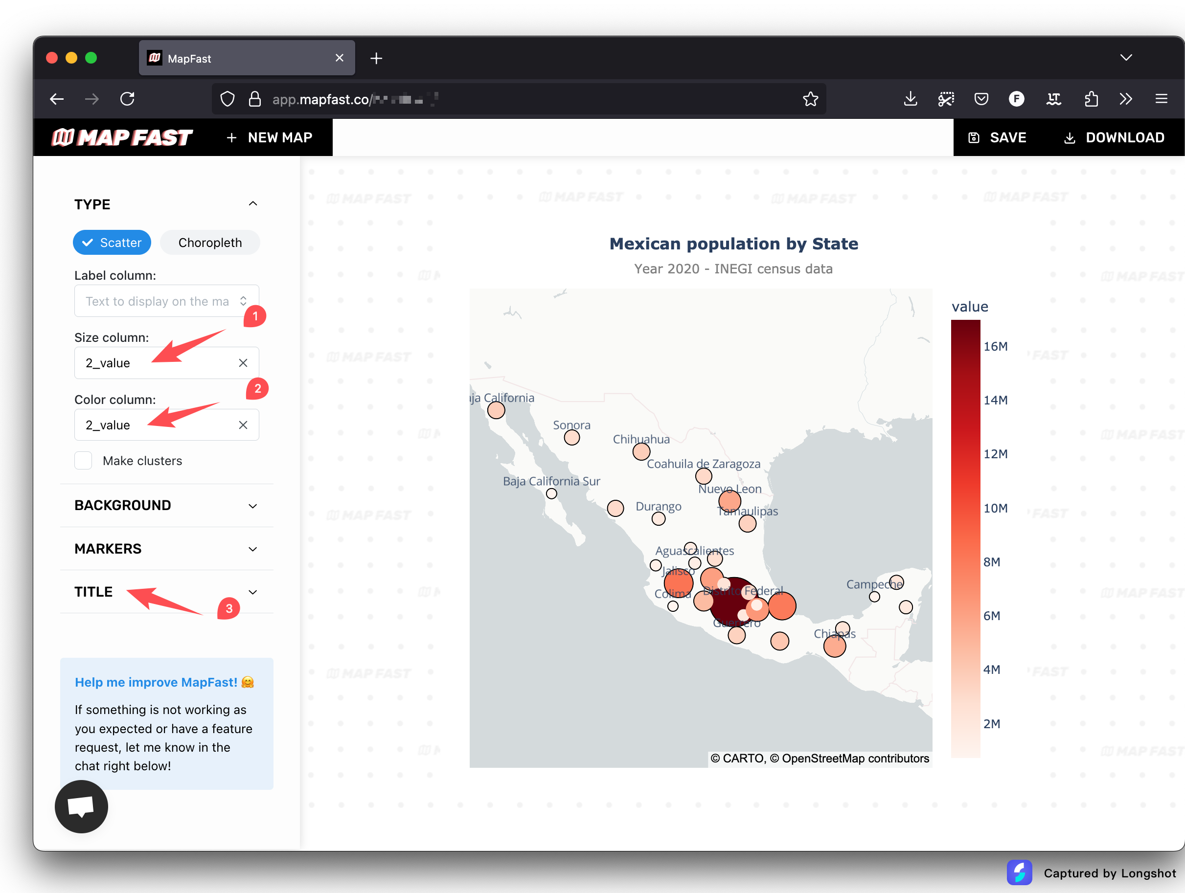
The sidebar on the left enables you to customize the map:
- The column to use to size markers
- The column to use to color markers
- The marker size (minimum and maximum)
- The title and subtitle of the map
- The color scale to use (linear, quantiles, fisher-jenks, etc.)
- The custom colors to use
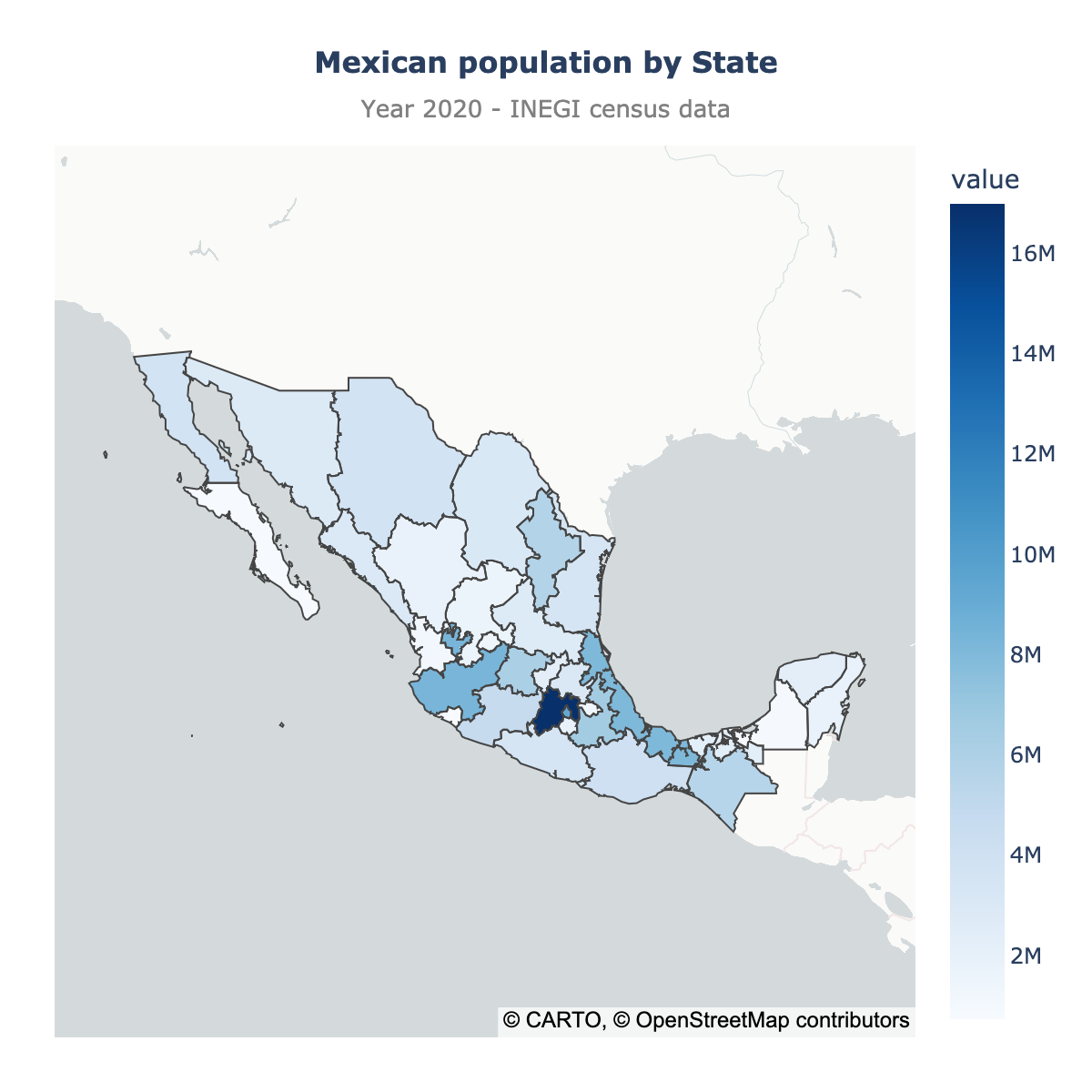
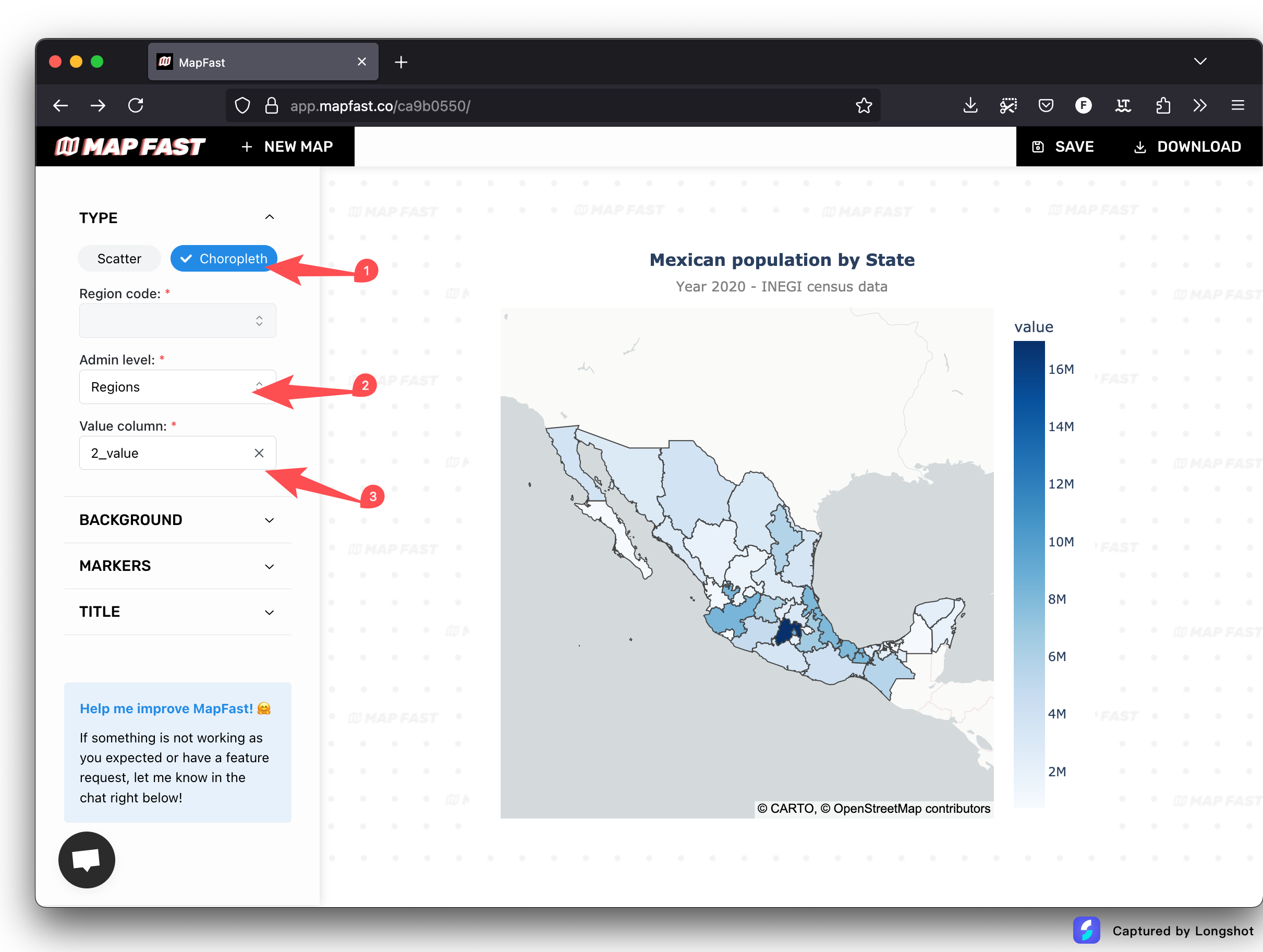
Choropleth map
The choropleth map is a map with colored regions. To create a choropleth map, it's three steps:
- Click on choropleth in the sidebar
- Select the administrative level you want to use: Regions, Counties, etc.
- Select a column for the value to display. This will set the colors of the regions.
Here is what it looks like for the population dataset:
If the match isn't perfect, open the table and edit the names of the regions until your data is aligned with the map.
Step 3: Download or share the map
Once your map is ready, you have two options:
- Download the map as an image (PNG)
- Share the map to other people (interactive page).
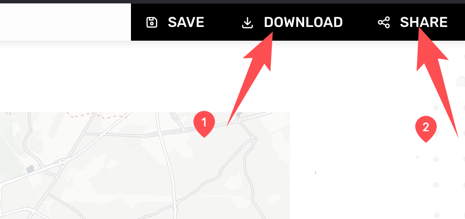
The two options are available in top-right corner of the app.
It's also possible to embed the map on your website : to do so, open the sharable link and copy the HTML embed code.
Conclusion
That's it! You have created a map of Mexico with your own Excel/CSV file. Effortlessly! 😉
You can now download the map as an image or share it / embed it on your website.
Happy mapping! ⭐